Top 4 factors to consider when creating pharmaceutical packaging
So you have a new pharmaceutical product launching soon and you need to come up with the design of it. It’s important to take some time to consider how all of the informational components come together on the package. Pharmaceutical products are copy heavy and need to relay what their product does and how to properly use it.
One of the most important aspects of marketing pharmaceutical products is showcasing that your product is something the consumer can trust. When you’re not feeling well you want to be taken care of and making sure that is translated into your pharmaceutical packaging is vital. When a person is looking to buy your product they want that assurance that what you’re providing will work.
Consider these factors when beginning your package design:
Clear messaging
We’ve all been there, walking down the cold medicine aisle at a local drugstore looking for something to get rid of the nasty cough we have. We’re met with boxes upon boxes of products that all say they help to reduce coughing and sore throats and we’re left wondering what is the right product for us to use to actually clear our symptoms.
This is where the value of strong messaging on your package comes in. You want the consumer to be able to quickly understand what your product can aleve for them. The majority of the copy on the package will likely be legal text that can’t be overly designed or distract from the content. Although there may be more restrictions to how you can incorporate this copy in a unique way, there are still factors such as emphasis of certain words or headers and the organizational structure of the information that can be taken into account. Think about how a consumer might be scanning the product to determine what order information is displayed.
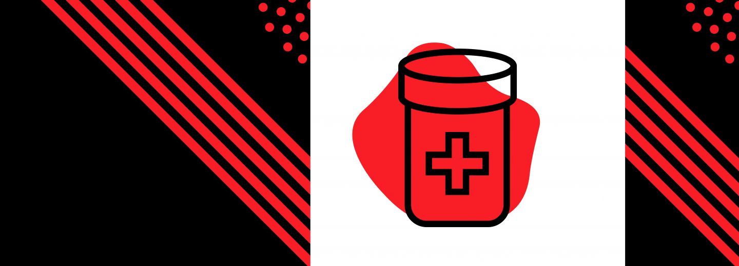
Also, ensure that if you have any icons or visual graphics to your packaging that they clearly explain what your product is or how it is used. You don’t want any visuals that take away from this message or make it unclear why it is a part of the design.
Target audience
Take into account your target audience and what types of copy or visuals they might be looking for when going to buy your product. They likely have a specific set of symptoms they’re trying to fix and you need to make sure that your product expresses that in a way that grabs their attention.
Make sure you’re researching and positioning your design to the demographic that’s going to be buying this product. Many pharmaceutical products have children’s versions as well as adult ones that have varying doses or active ingredients. While the children’s packaging might have some cute graphics that easily highlight it’s meant for a younger audience, the person going to buy it is likely a worried parent trying to quickly find something to alleviate symptoms. Because of this, the positioning of the product should be focused around what the most important information to that target buyer is. This might be that congestion is reduced for up to eight hours or that it relieves a fever.
Understanding who is buying your product and for what reasons allows you to adjust the design to meet their needs.
Shelf Appeal
Like with any other product packaging, you want your product to stand out amongst the other over the counter options. Think about how you can utilize minimalist packaging to simplify your messaging. People aren’t looking for super flashy products when they’re buying medication they want what they’re looking for to be straightforward. If there’s too many extraneous details to the design people might assume that you’re trying to overcompensate or covering up certain information about the product.
This doesn’t mean that you can’t have a strong visual identity to your packaging. Perhaps you can use unique icons or colors that distinguish your products from competitors. We all have that mental image of what a Tylenol or Advil package looks like. The iconic red color of Tylenol is easy to pick out on the shelves. So even without a lot of details, you can work to create a strong story through the colors, fonts, and graphics used on the package.
Color theory plays a big role in the initial emotional reaction to a product. That is why it’s important to carefully consider the use of color on the packaging. Blue tones convey a sense of trust, confidence, and wisdom. It also elicits a feeling of relief and cooling so if your product works to reduce pain a consumer might gravitate towards colors that appear more soothing.
Package Safety
Just as important, if not more so, as the overall aesthetic of the product is the quality and safety of the packaging. The product must be properly sealed so that moisture can’t get in or so that a lid can be resealed.
Consider things such as child safety or having the product separated by dosage. The structure of the packaging comes first when working to release a pharmaceutical product. Design can be put into place once storage needs are met. Having things such as a child safe lock on the lid not only protects the product from any environmental elements but it might also be something that your consumer is looking for when buying. Products that are sold in boxes with blister foil packaging allow for easier access to the medications which must be taken into account alongside who the target audience is.
Pharmaceutical packaging isn’t meant to be in fancy containers that are put on display in a bathroom. They are practical and need to meet strict guidelines to ensure their safety is maintained. So while the design of the product is still valuable when marketing, make sure that the package itself can hold the product properly and have the graphics play off of that.
Pharmaceutical packaging is crucial
While pharmaceutical packaging may not be as showy as other types of packaging, the way information is represented is vital in ensuring that the consumer trusts the product and company. Taking the time to really consider the emotional tone that the typography and color theory has on the packaging can help you to target your specific pharmaceutical demographics.