Caution: Contents Hot—Award-Winning Local Coffee Roaster Gets a Fresh New Look
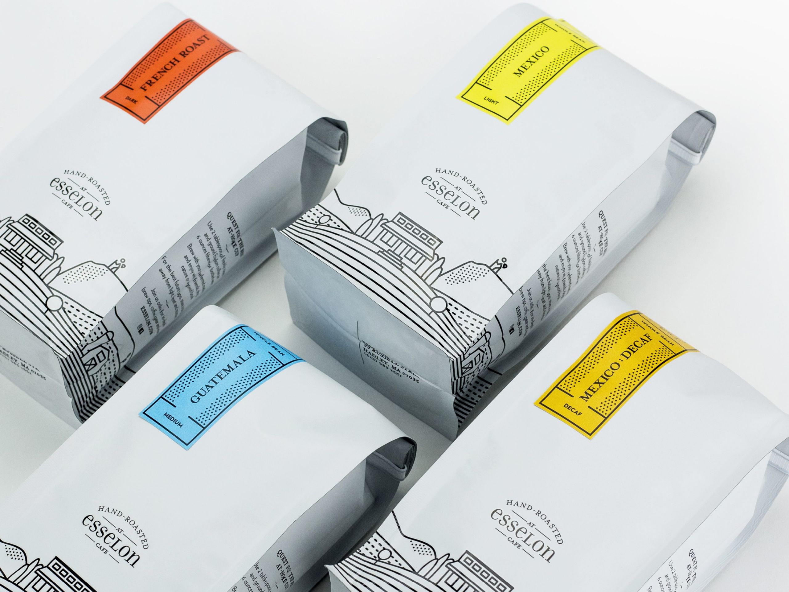
BRIGADE draws upon local imagery to craft a strategic new brand identity and packaging design for the popular Massachusetts café, Esselon.
Esselon is a much-loved local coffee roaster that came to BRIGADE for a serious brand makeover. The celebrated roastery and café has built a loyal following on the quality of its product—artisanal, small-batch coffee with an emphasis on Direct and Fair Trade. The company grew up with a rustic, simple look and a two-color design scheme. Esselon was ready to take it to the next level and was looking to achieve a new brand identity they described as desirable, clean, and refined.
“Elegance without being elegant” is how the Esselon team put it. We love it when our clients challenge us with a design framework that seems contradictory (and yes, we knew exactly what they meant!).
Esselon approaches every stage of their production with meticulous care: sourcing the best green coffee beans available within their product price-point, and “cupping” (individually brewing and tasting) to ensure their target quality is met.
Another unique feature of Esselon is that they roast their coffee on-site in their café, in Hadley, Massachusetts. The café itself is in an iconic local spot, located on a busy road at the intersection of several college towns, yet backing up to lovely farmland. Passersby are delighted to discover this not-so-hidden treasure.
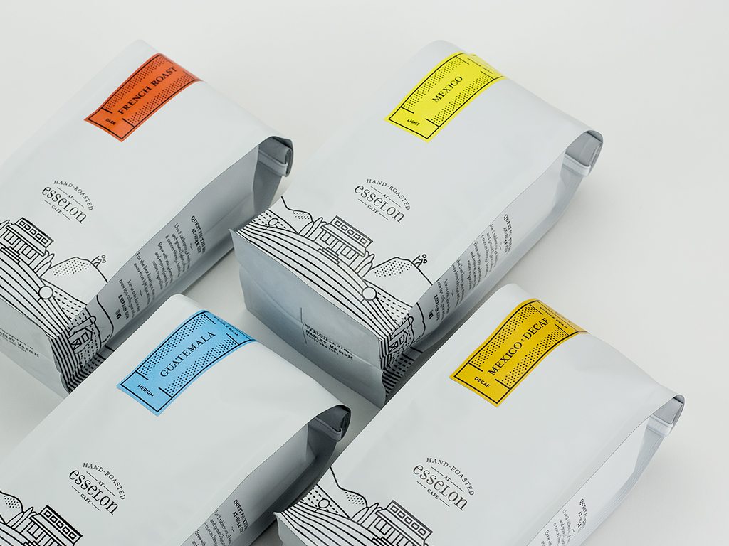
“Esselon’s café is a meeting ground—a place where people come together to discuss ideas, share conversation, and practice their daily coffee rituals,” explains Designer Steve Oparowski. “We knew we wanted to feature the art of roasting and the science behind the perfect cup, and create a package design that would leverage the café’s local reputation for potential national exposure.”
The BRIGADE team set out to capture Esselon’s new identity with a bag that would stand out on-shelf and encourage local grassroots brand growth while driving potential presence in national chains. Could we fit all that on one 16 oz. bag? Designer Steve Oparowski, Executive Creative Director Kirsten Modestow, Design Director Jan Šabach, and Associate Creative Director Joe Marden tackled the challenge.
“Capturing the iconic Esselon café meant capturing the vibe of Hadley. I tried to create an accurate representation of the Seven Sisters mountain range, which forms the backdrop of the town” explains Steve. “I love it when I get to pull out the pencil and paper and start with a sketch.”
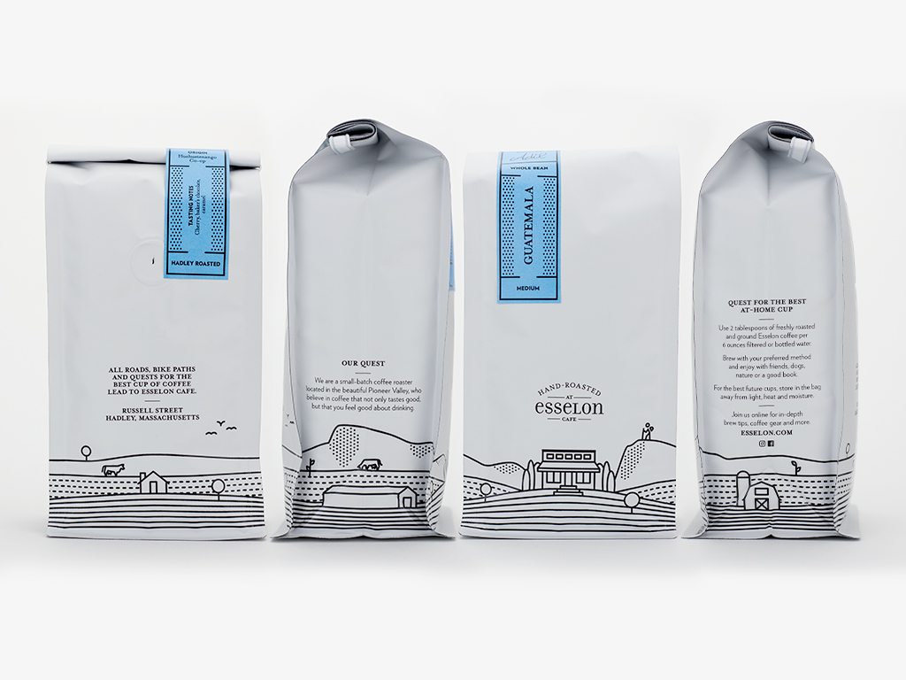
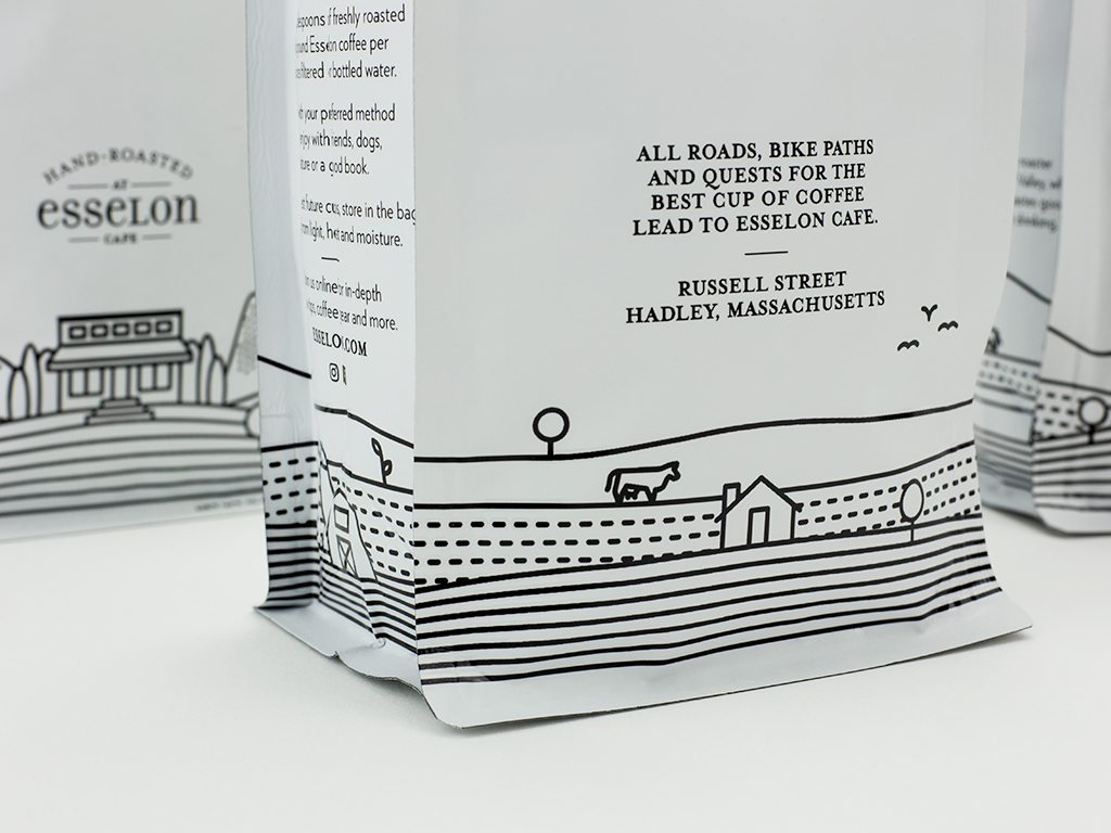
Steve experimented with different graphic elements to capture the agricultural setting and unique character of the valley, balancing the messaging of the visuals with their aesthetics. After some experimentation, the design team selected a suite of simple and appealing graphics including cows, barns, and a hiker. They then applied those designs across a captivating landscape of flowing graphic horizon lines rendering fields, pastures, and mountains.
“The unplanted fields create instant visual associations with the locally-grown movement, which says ‘this is local, it’s all done here’ without having to actually say it,” says Steve.
The design also features Esselon’s iconic café building front and center, a set of ascending stairs leading to its front doors, creating a warm and welcoming feeling that draws coffee-lovers in.
Interestingly, Steve explains that giving the brand a strong sense of local identity is not in conflict with Esselon’s goal of national exposure, but will actually drive it. The tidal-wave of consumers choosing small and local brands are increasingly seeking specialty products tied to a specific place—even if that place is not local to them.
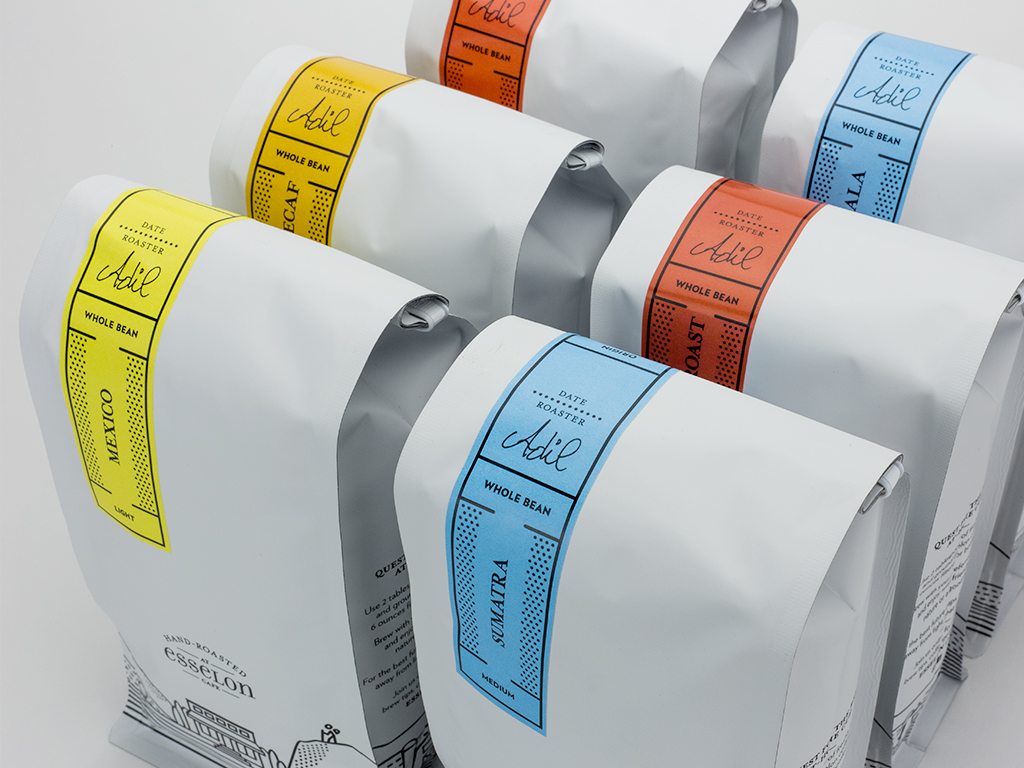
“We want people who pick up a bag of Esselon coffee in a Whole Foods miles away to feel like, ‘I want to go to that place, I’d like to visit that café.’”
To achieve the clean, refined look Esselon wanted, Steve was inspired by the work of Virginia Lee Burton, particularly her landscapes which form elegant stylized patterns out of topographical lines. Steve’s design also includes ample negative space, simple linework, and a black-on-white scheme.
At BRIGADE, our job isn’t done until the client is positively thrilled with the design—simply liking it isn’t good enough. It’s safe to say Esselon is crazy about their new look. They’ve already used it to launch a new website and dive into several new product avenues including a snazzy line of retail products, and K-Cups are coming soon.
Coffee, anyone?
Learn more about our work here.


