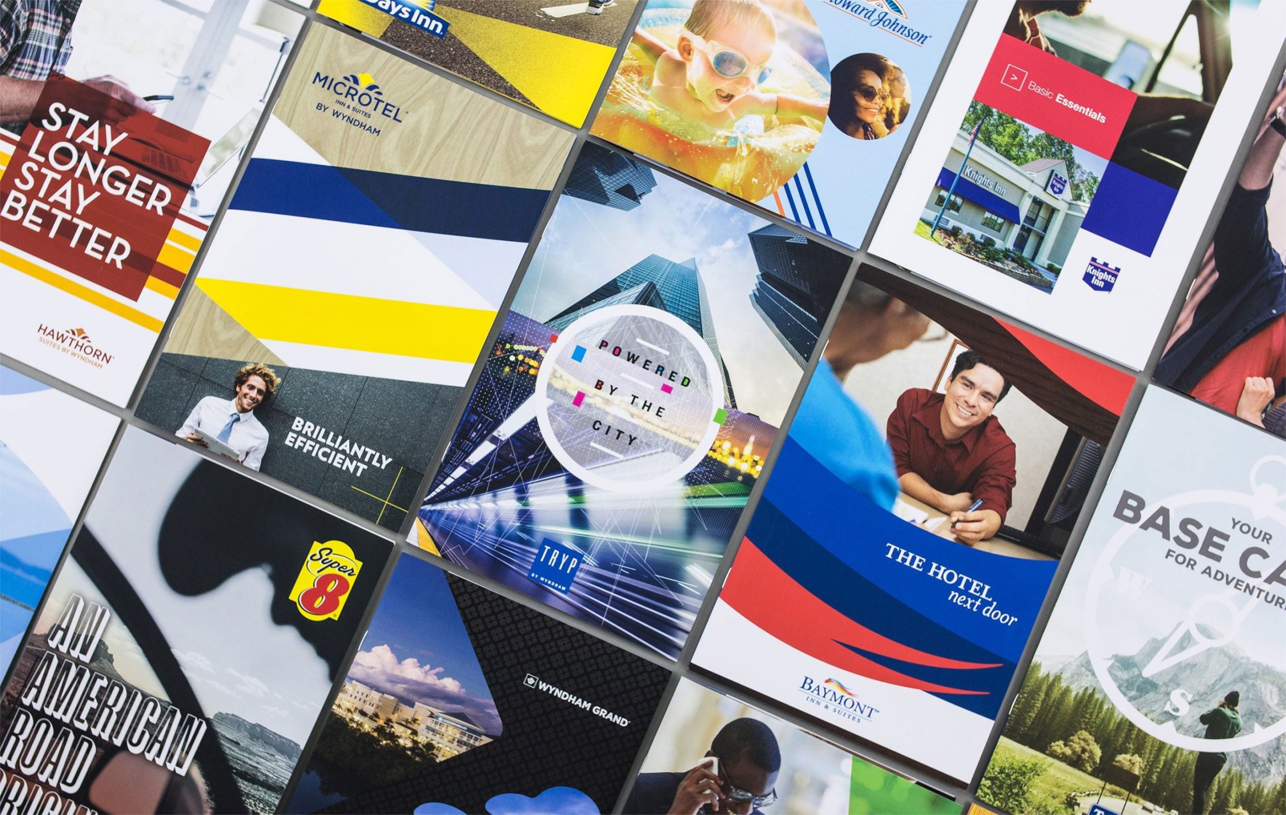
Scaling a hospitality powerhouse from 15 to 24 brands
- Ongoing Brand Development
- Creative Strategy
We have worked on multiple facets of the Wyndham portfolio since 2019—from the franchise development team, to the individual brand leaders, to the global sales division, rewards program, and more.
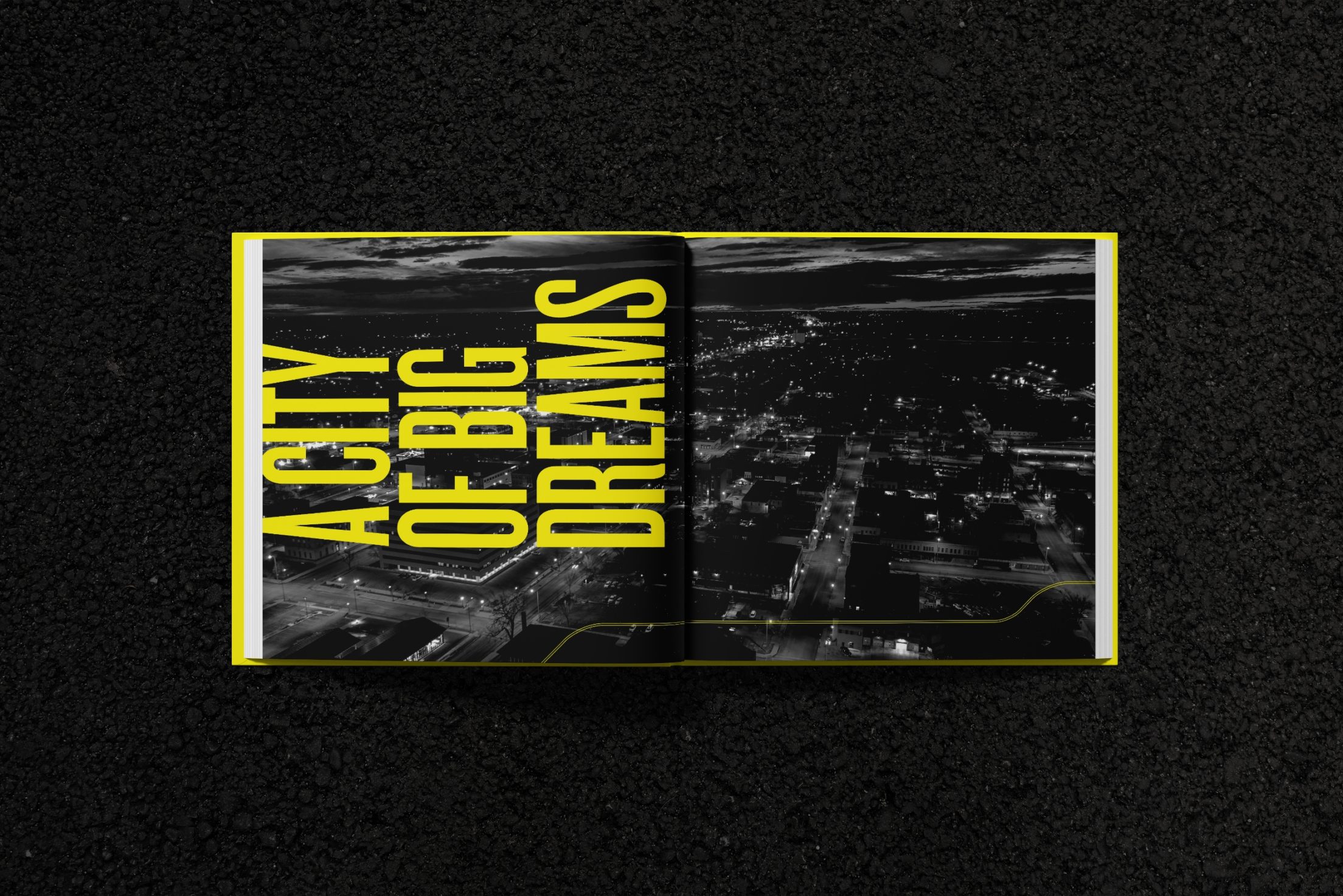
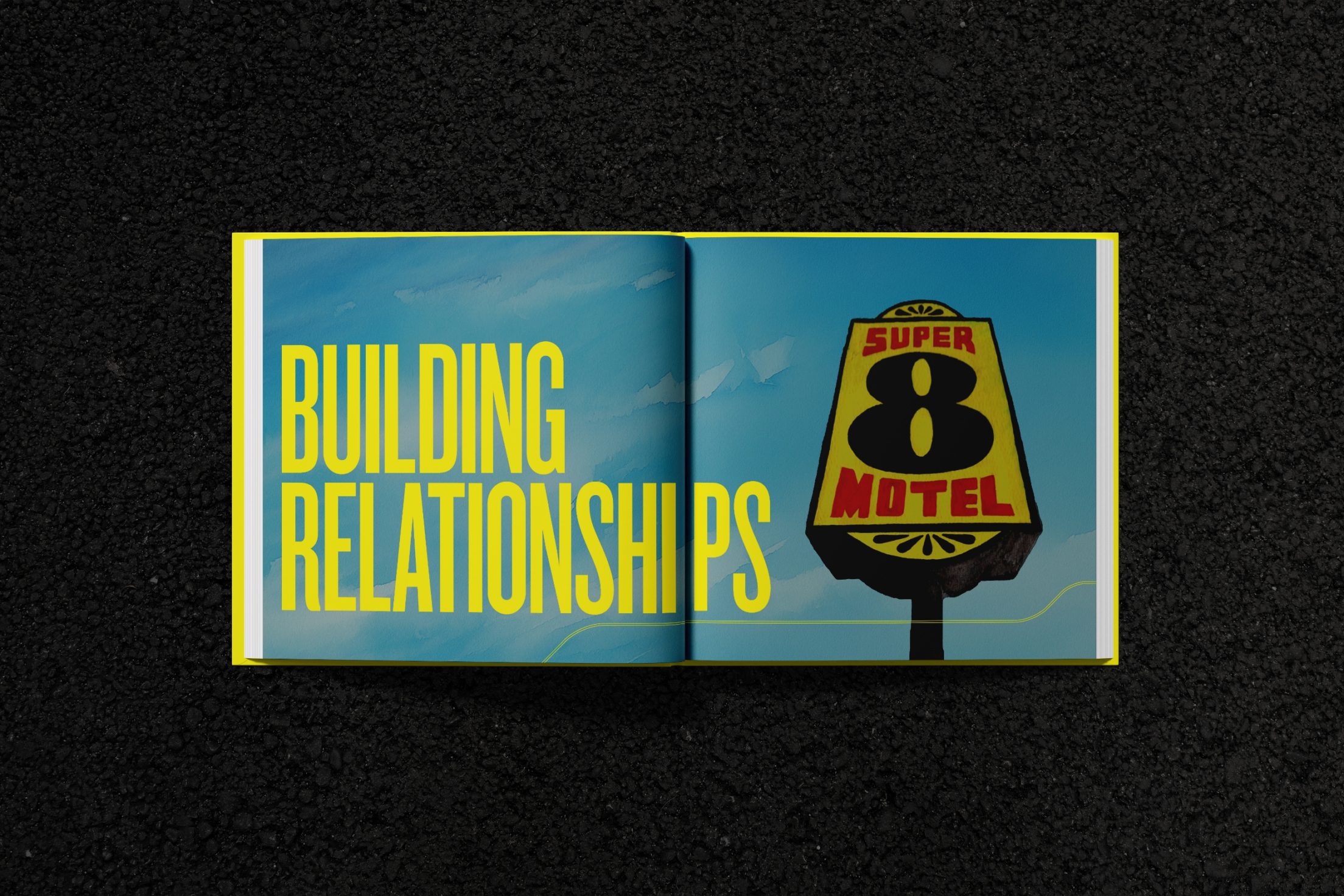
In early 2025, to celebrate the 50th anniversary of the iconic Super 8 brand, Wyndham partnered with us to create a one-of-a-kind coffee table book. Spanning 88 pages, the book brings the Super 8 story to life—spotlighting everything from the very first Super 8 in Aberdeen, SD to the brand’s far-reaching international locations. Packed with vintage photos from the 1970s and evocative travel imagery, it strikes a vibrant balance between nostalgia and the road ahead. Designed to inspire pride and connection, the book will be shared with owners and displayed in Super 8 locations around the world.


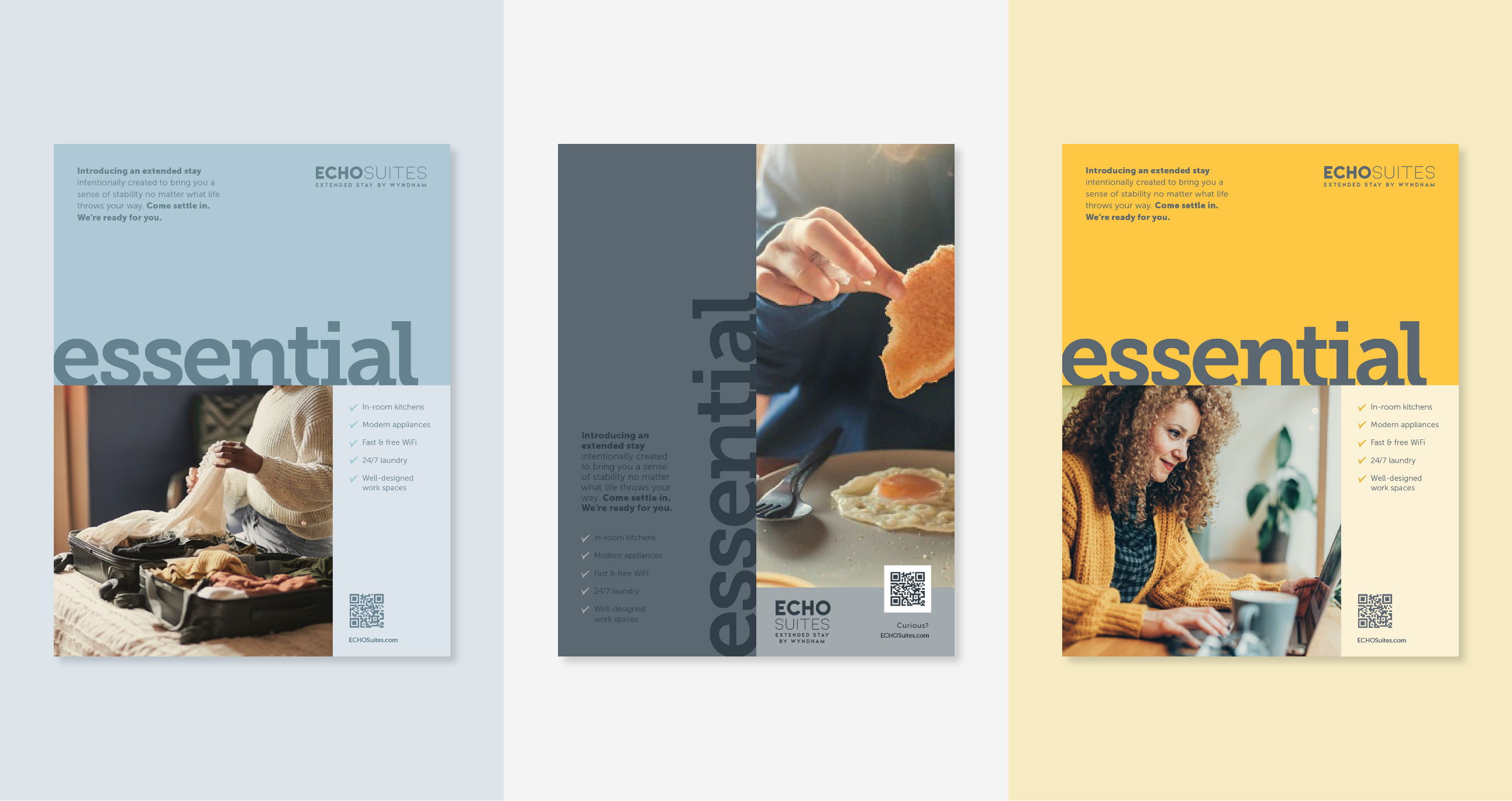
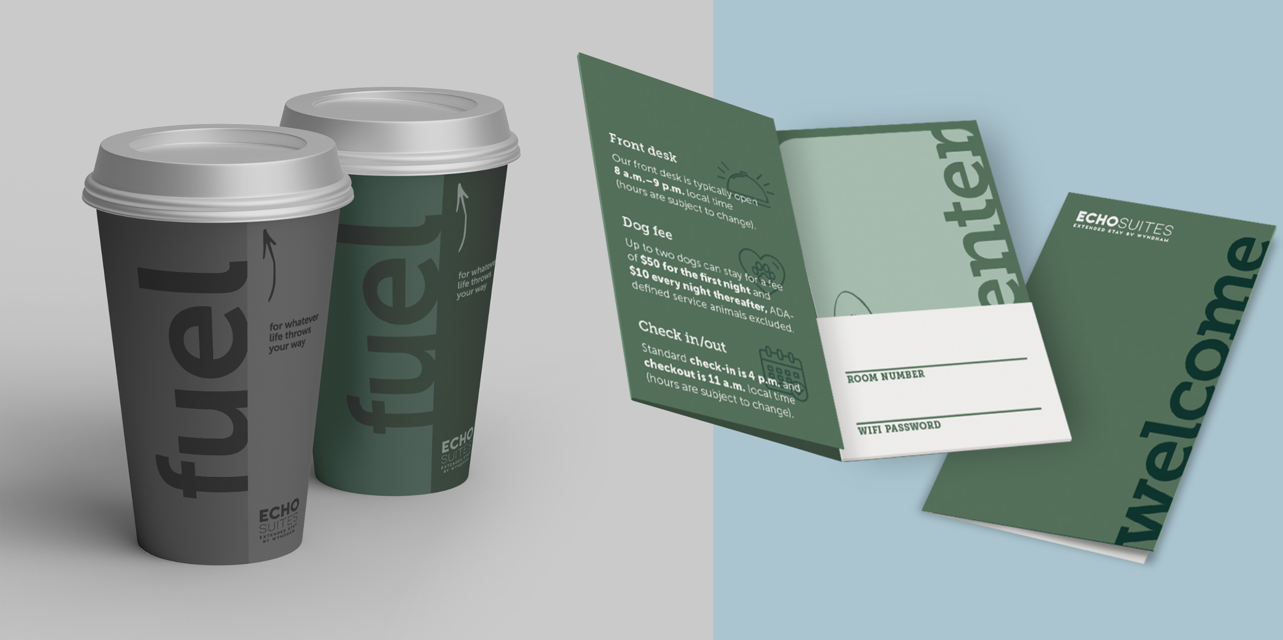
In 2023, inspired by post-Covid trends, Wyndham set out to revolutionize the hospitality space with their first all new-construction, economy, extended-stay brand: ECHO Suites. BRIGADE worked in tandem with the brand team to help build an identity that differentiates the new model and create a foundational toolkit to help the brand expand.
Tackling everything from positioning to, logos, color palettes, and initial design, we worked with the team in the early stages (even in the architectural phase) to create a seamless identity throughout. The overall thematic was built around “thoughtful essentials as a foundation for your stay.”
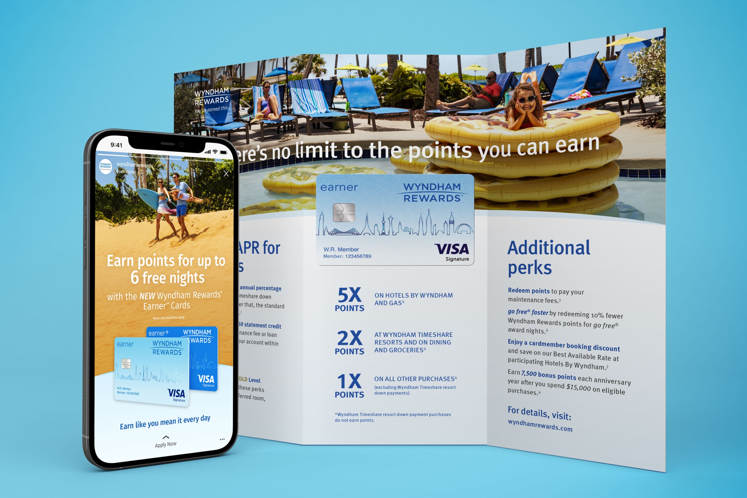
We helped the Financial Partnership team refresh the Wyndham Rewards credit card program and launch a new Rewards credit card for small business owners.
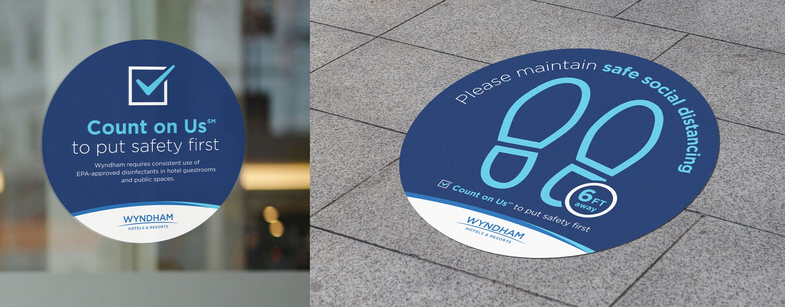
In the early spring of 2020, we worked with the Brand Marketing team to develop a campaign to promote their COVID-19 health and safety protocols in their U.S. and Canada hotels. As the pandemic swept quickly through the world, competitors were already launching branded health and safety programs, so we moved quickly to develop a video and on-premise collateral that activated the campaign across all channels.
In 2019, we worked with the Brand Marketing team to launch their new hotel prototype. We completed a naming exploration, which culminated in “Moda,” and developed a comprehensive launch campaign. Since the successful March 2019 launch, more than a hundred hotel owners have signed on to build their properties using the new prototype.
In 2018, we also collaborated with AmericInn by Wyndham to optimize the brand’s positioning as America’s Welcoming Neighbor, and help them grow their national presence with a new look and feel. We developed a new creative campaign, executed it on‑premise and off, and extended it to OOH and video. By 2019, 83% of the portfolio was new construction. Since then, the brand’s footprint has grown to 206 properties across the U.S.
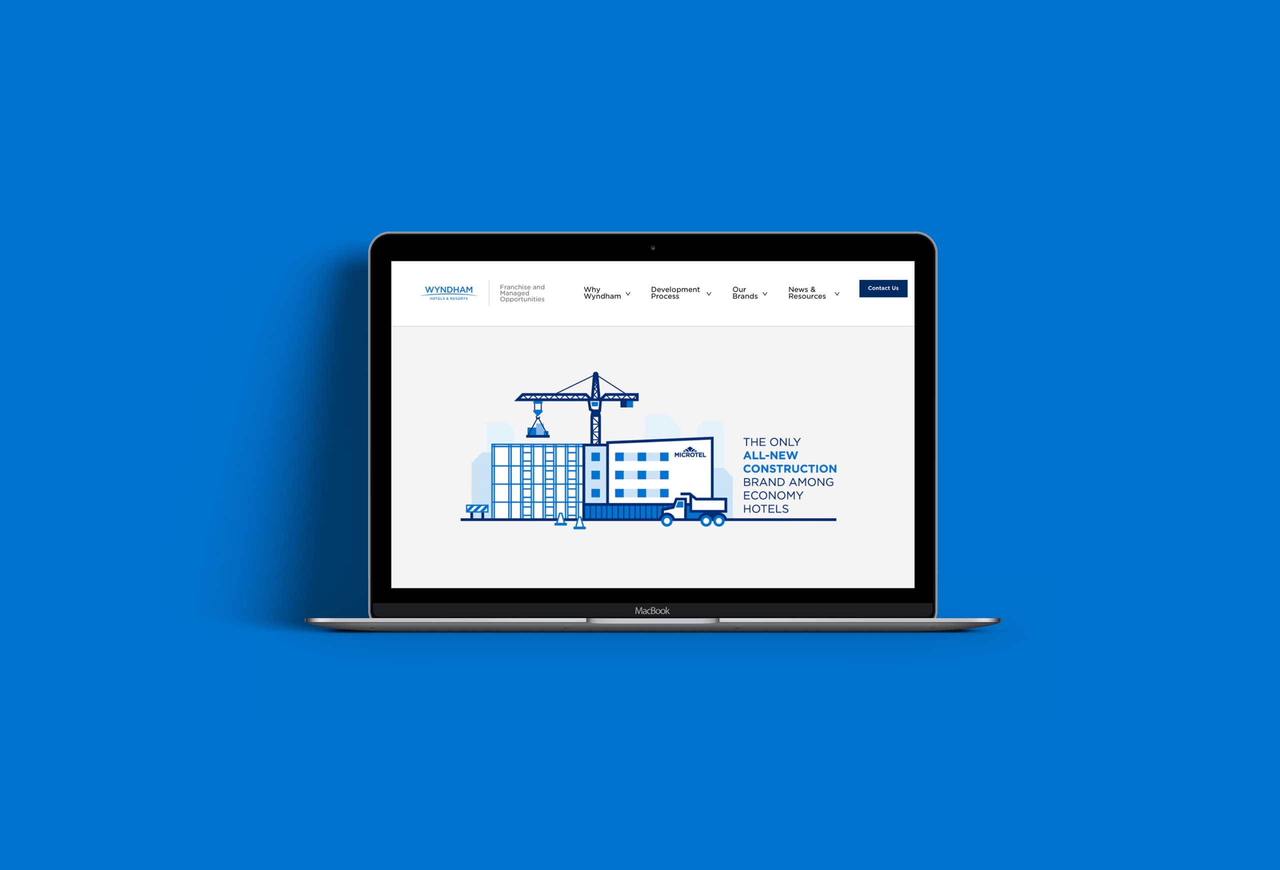
Another big project in 2018 was a collaboration with Franchise Development on a new website to connect with potential franchisees and owners. We helped the team from start to finish, working on content hierarchy, copywriting and editing, infographics and icons, and overall design.
We refreshed Days Inn, an iconic brand with great recognition but an outdated look and feel. We developed a bold and upbeat visual identity, updated tone of voice, and unifying guidelines that helped their team increase consumer awareness to 71% the following year.

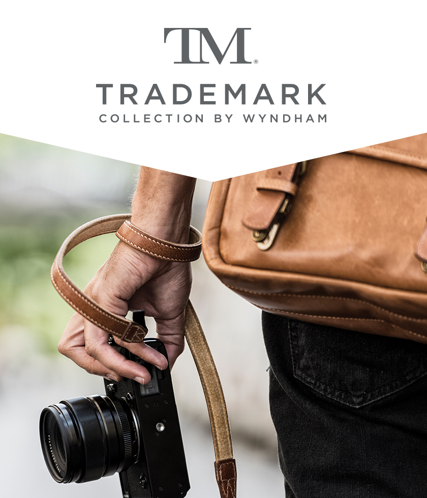
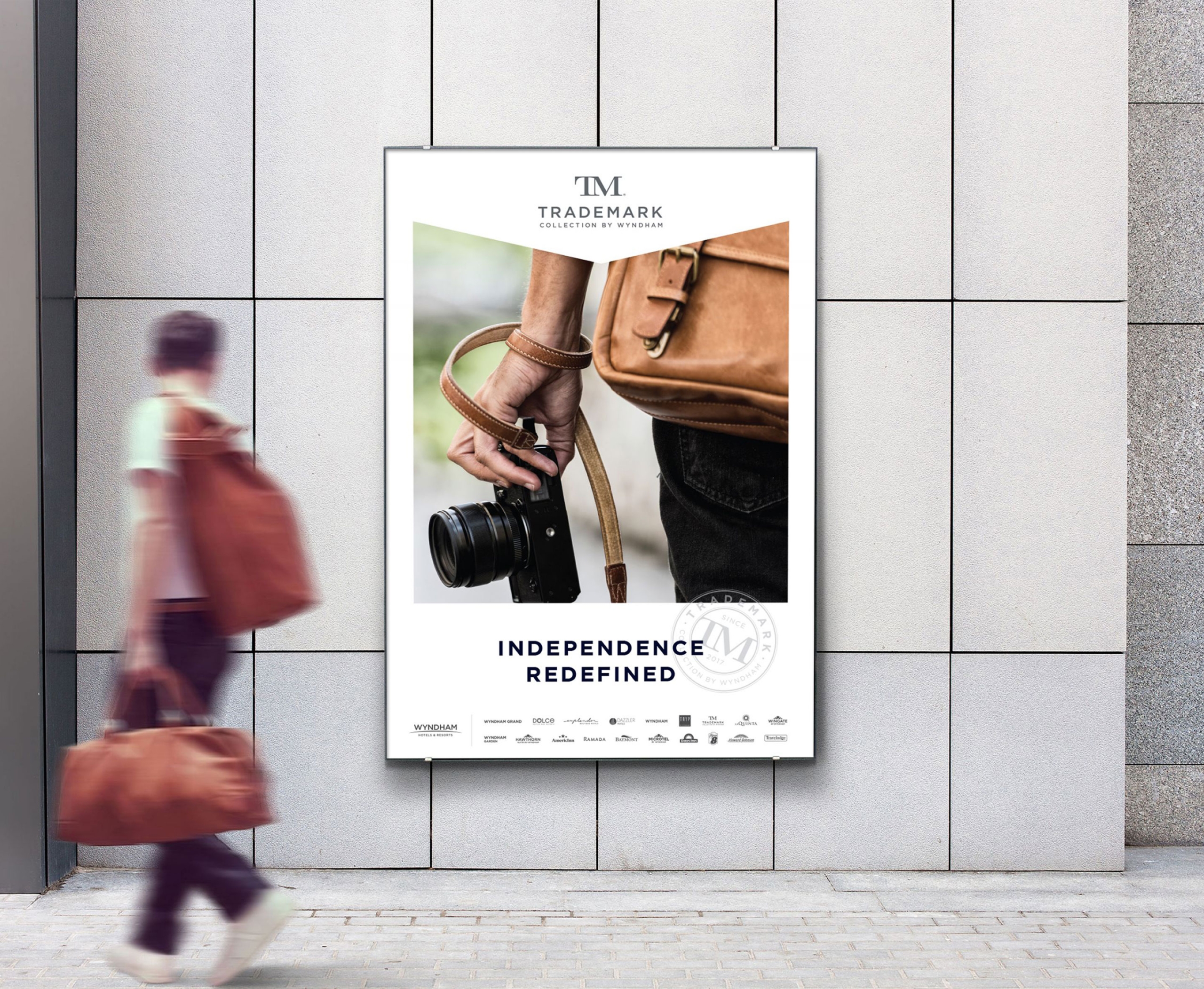
We developed a distinctive identity from the ground up for Trademark Collection, a soft-branded portfolio of independent upper-midscale hotels. The end result was a solution that enabled hotel owners to maximize their personality while leveraging Wyndham’s scale and marketability. The Trademark Collection is currently the company’s fastest-growing brand, and since 2018, has seen a 73% increase in its global footprint.
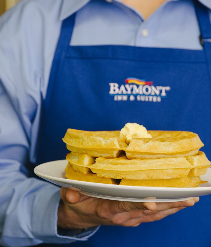
In 2017, we developed a new brand identity for Baymont Inn & Suites to activate their “hometown hospitality” story for a new consumer audience and unified collateral for franchisees. We also wrote, shot, and oversaw production of a national campaign. Since 2017, the brand has seen a 28% increase in properties across North America.
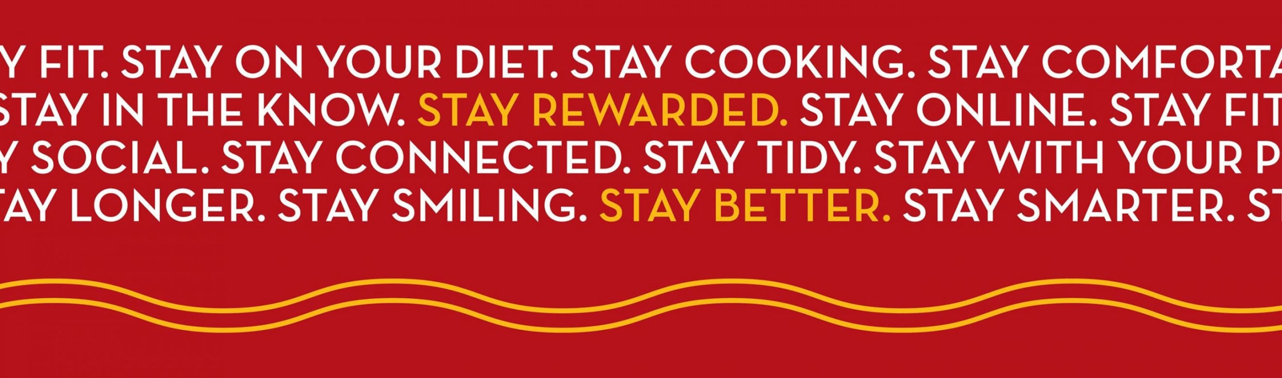
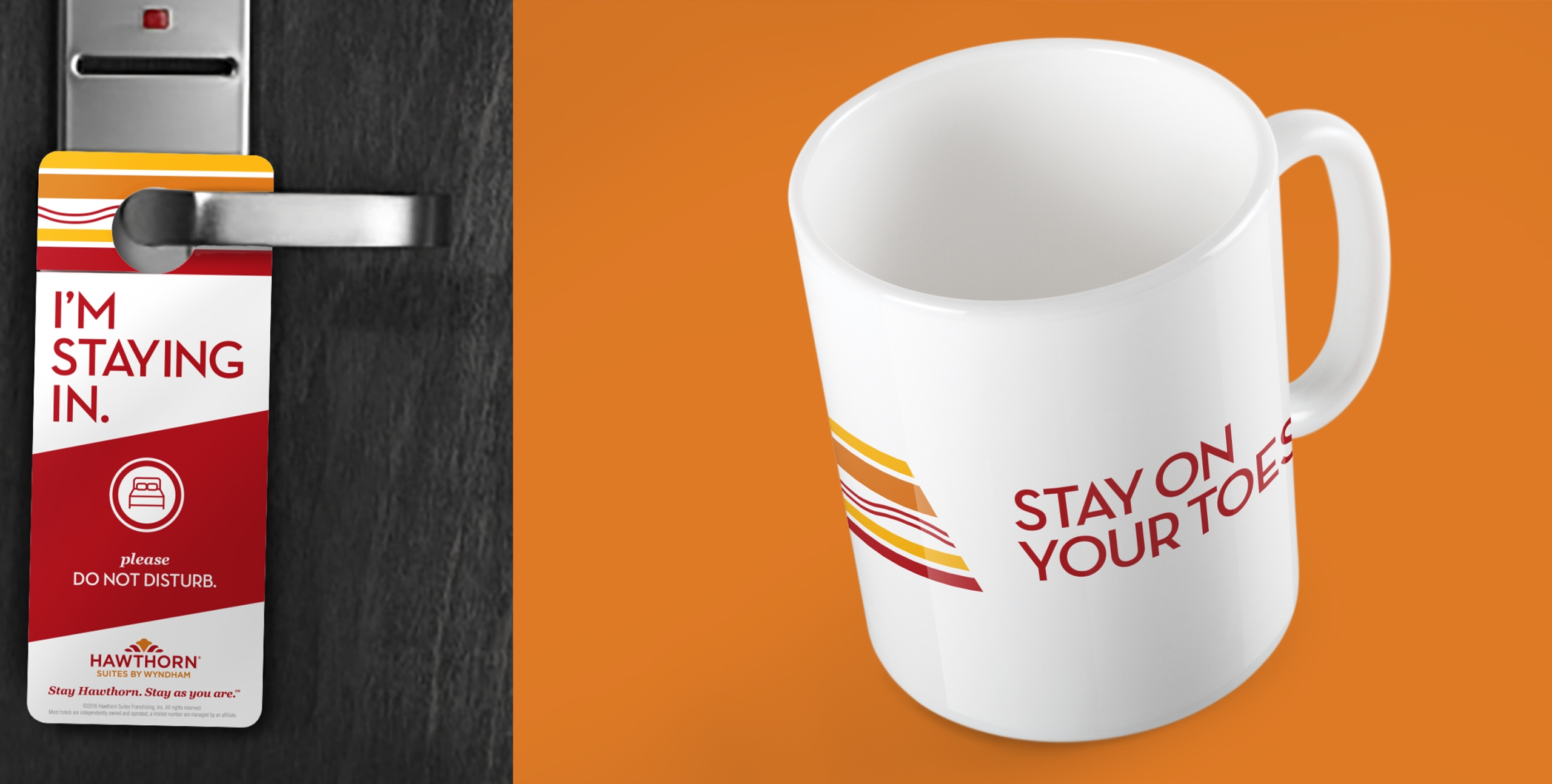
In 2016 we also helped the Brand Marketing team reposition Hawthorn Suites to highlight its flexible amenities and position the brand as a friendly, reliable extended-stay option. Since 2021, Hawthorne Suites has seen a 50% increase in its pipeline.
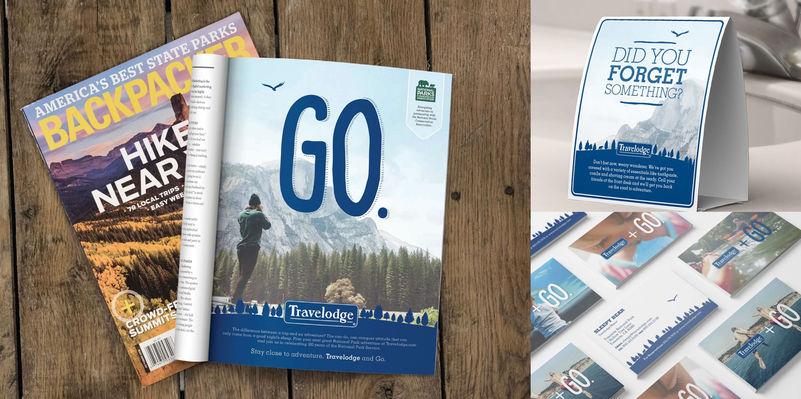
We rebranded the iconic Travelodge hotel chain to more effectively express their key attributes and appeal to a younger generation. We developed a powerful new brand mantra, campaign, and hook, “Travelodge + GO,” and activated it consistently across property collateral, advertising, and marketing materials.
We helped the Franchise Development team audit and capture all of their existing brand identities in brand books. With 15 standardized brand books, Wyndham was able to identify which brands needed a refresh or repositioning.
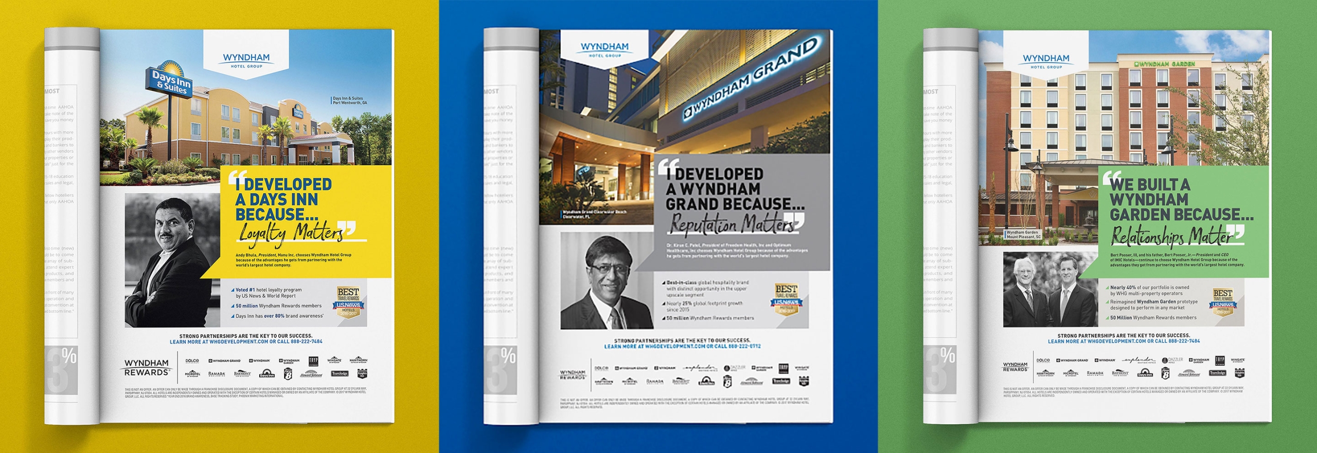
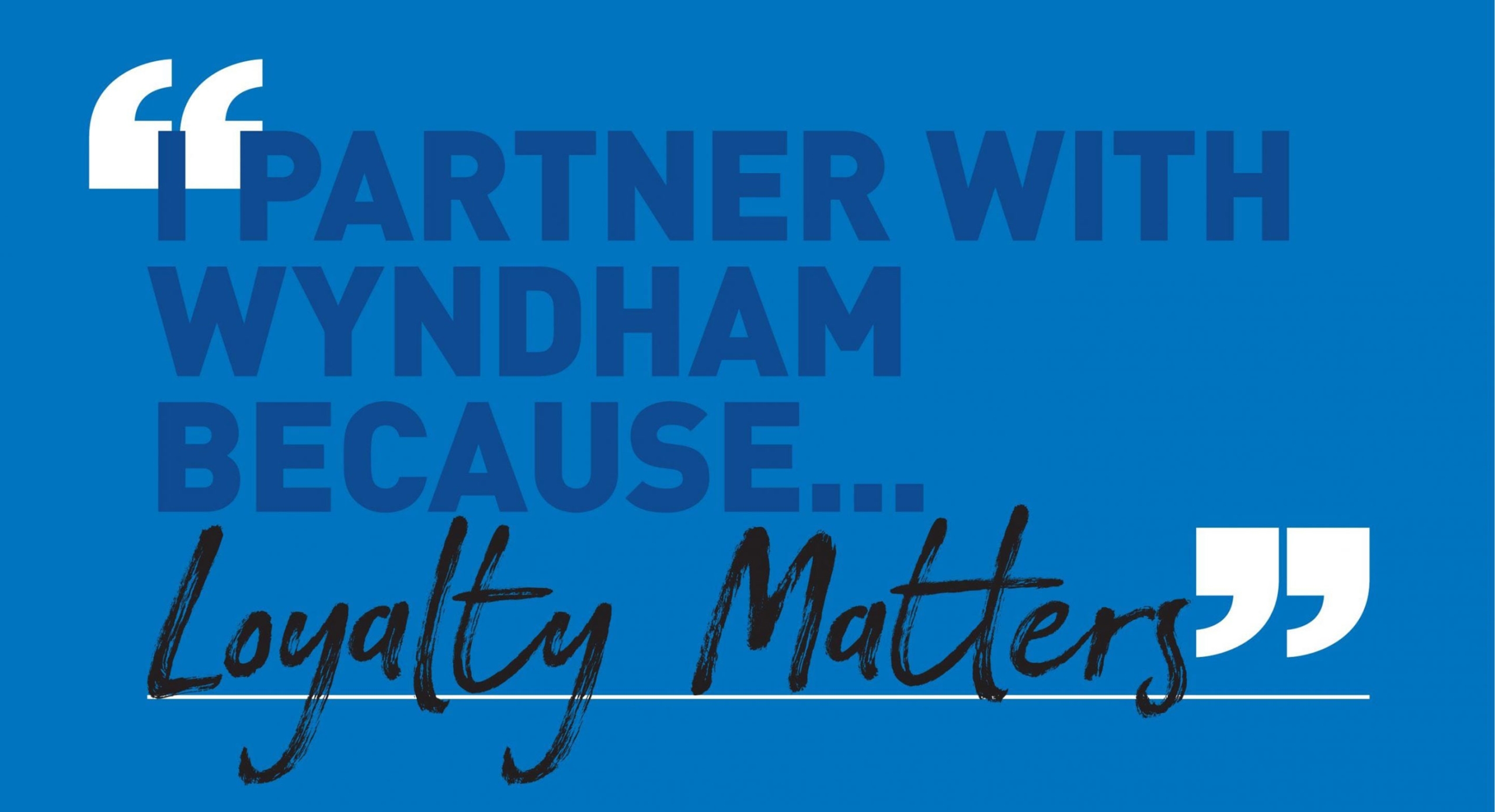
In 2014, Wyndham embarked on a major marketing overhaul. Our partnership began with a B2B advertising campaign to engage prospective franchisees and celebrate their incredible length of partnerships.