Retail marketing strategies: effective packaging design


Creating effective packaging for retail requires thoughtful strategy, creative art direction, and consistent execution. Strong attention to detail is needed to make products stand-out on store shelves. At the same time, the right balance of branding, education, and product promotion is crucial for drawing in all consumers.
Although that seems like a lot to pay attention to, there are ultimately 3 vital things to think about when developing packaging for a retail environment.
Product Functionality
First and foremost, think about the product inside the packaging. How can you design the packaging to benefit your product?
Consider how the packaging can protect the product in the retail environment and about how many potential threats lie in wait:
- Weather damage/temperature fluctuations
- Human errors, e.g. dropping the packaging on the floor while stocking the shelves
- Dust
- Breakage
- Various environmental factors
Good packaging design will protect from all of these things. In turn, the product will remain in one piece, so you don’t lose revenue from damaged stock.
Furthermore, good packaging design allows the consumer to easily see what the product is and what it does. When there is competition on-shelf, why give consumers a reason to pick “the other guys”?
From a product perspective, make sure your packaging both protects and showcases what sits inside.
Design Functionality
Along with product functionality, you should consider design functionality, focusing on how your packaging can maximize potential in-store. Remember, the retail environment is incredibly crowded. Your product will probably be sandwiched between loads of others, so it needs to stand out.
This requires a precise understanding of where your product will be physically placed in the retail environment. You have to conjure up a design that makes it easy for the product to fit on shelves or be stacked. Obviously, a lot depends on what type of store your products will be in and what you’re competing with.
With that in mind, ask yourself these questions when reviewing the functionality of your design:
- How/where will the product be featured in the retail environment?
- Will it be placed on a standard, dimly-lit shelf?
- Will it be part of a custom display?
- Are you trying to stand out in a big box store or shine in a convenience mart?
Your answers should give you an idea of the specific packaging design elements to take into consideration. Know your environment and its limitations, and let that fuel a lot of the design process.
Following from this, first impressions are incredibly important. You need an eye-catching design that has customers turning their heads — blending in is the worst thing you can do! The best retail packaging showcases a distinctive point of view, clearly showing the target audience why it is unique from the rest.
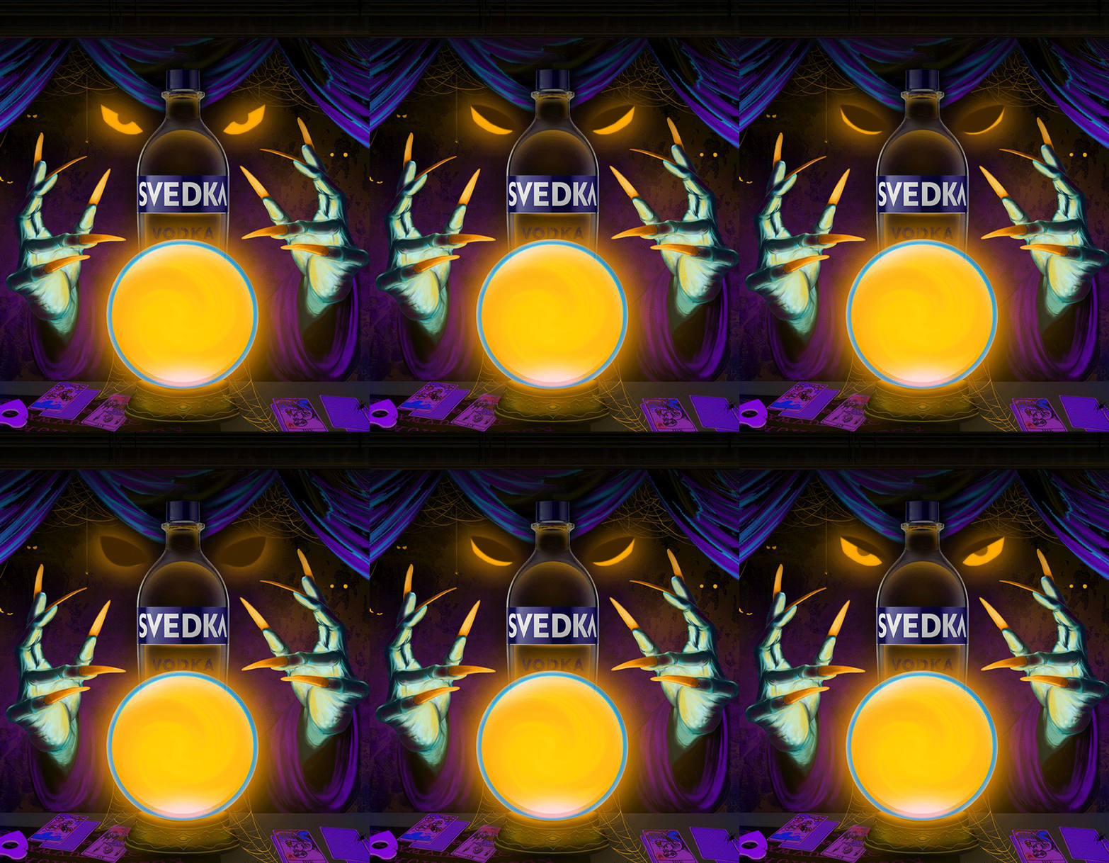
There are some great examples of innovative and eye-catching product packaging here. You can easily imagine how some of these examples stand out on-shelf!
Lastly, work some emotion into your designs. Packaging can elicit emotional responses in consumers. Someone can look at your product and feel happy or excited. A lot of this comes from the colors you use. Check out this color emotion guide to learn more.
Marketing Functionality
The third and final aspect of effective packaging design is marketing functionality. In essence, how well will your packaging market the product and your brand?
You put a lot of work into your marketing strategy, and the packaging design should be your best marketing collateral. After all, a huge percentage of your customers will only come into contact with your products in-store, on-shelves. How many times have you walked into a store and bought a product you’d never heard of before? It happens so often.
With that in mind, you need to educate, sell, and convince shoppers that your product is worth their money. In the retail environment, the only way to do this is through packaging design. Consumers should glance at your product and know what it is, what it does, and why it’s better than the one next to it. Again, having an eye-catching design helps to set things in motion. The more eye-catching it is, the more people will glance at the product.
Be sure that your packaging also stays in line with your brand image. It wouldn’t make sense to set up an image that paints your brand as a friendly and playful company, only to create packaging that’s dark and severe. Keep it consistent to continue building brand awareness.
Of course, don’t forget the two vital elements of marketing functionality: brand logo/name, and the product name. These need to be the most visible things in the design!
Assess and Update
To round off this blog we will end by saying that these three points are the main things to keep in mind when designing product packaging. Nevertheless, it’s beneficial to still assess and update a product’s retail packaging to stay competitive and relevant.
What if your retail partners move your in-store positioning? What if your big competitors come up with an innovative design that makes yours sit in the shadows? You need to keep an eye on everything that goes on to ensure that you’re never left behind. If any changes do occur, then be sure to alter your packaging accordingly.
At the end of the day, great packaging can make up for an average product. But, poor packaging can ruin an otherwise excellent product. It doesn’t matter how great your product is: if the packaging isn’t up to scratch, then a lot of people won’t buy it.


