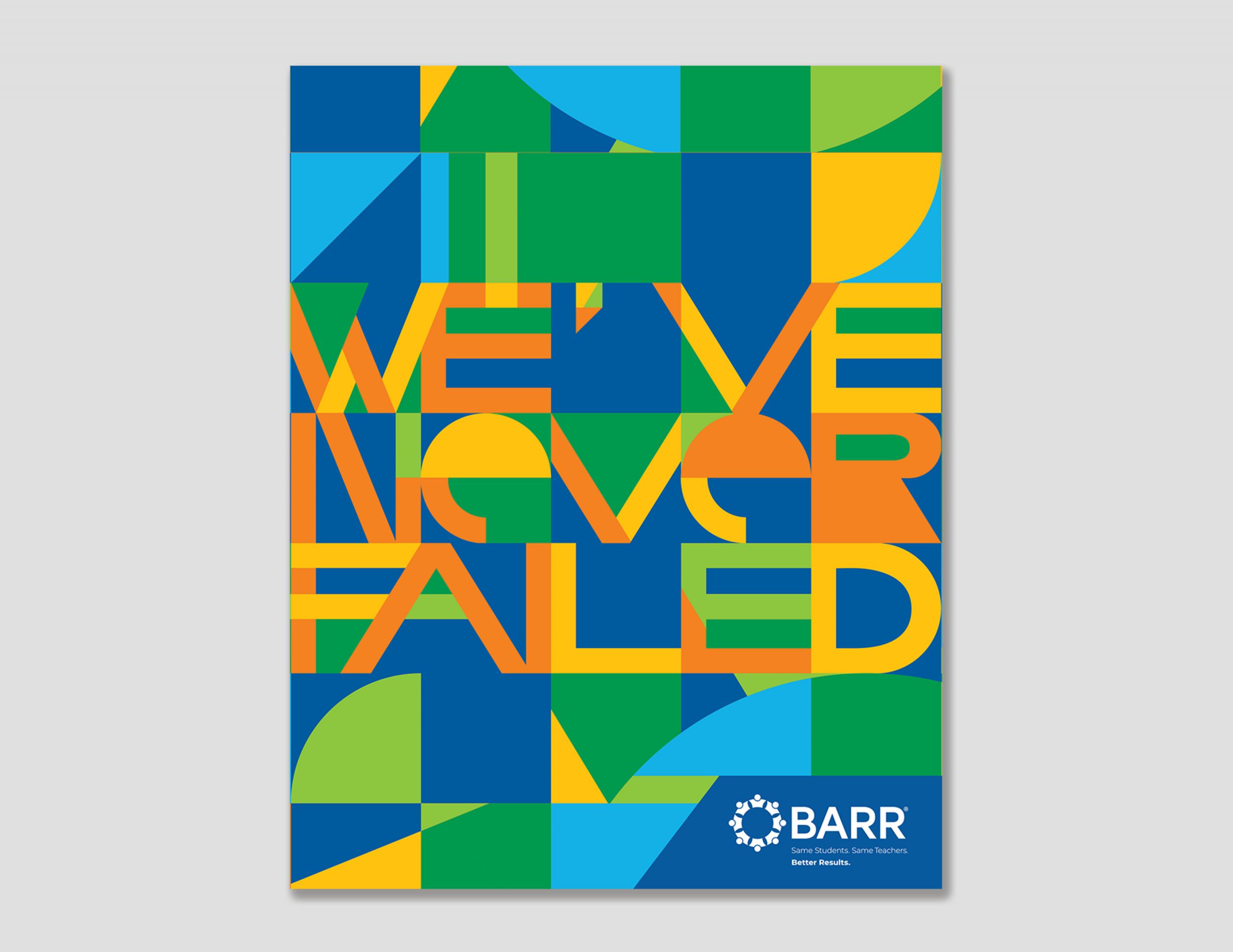
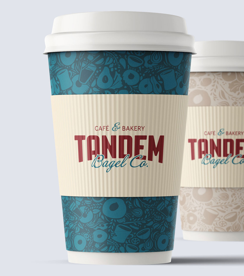
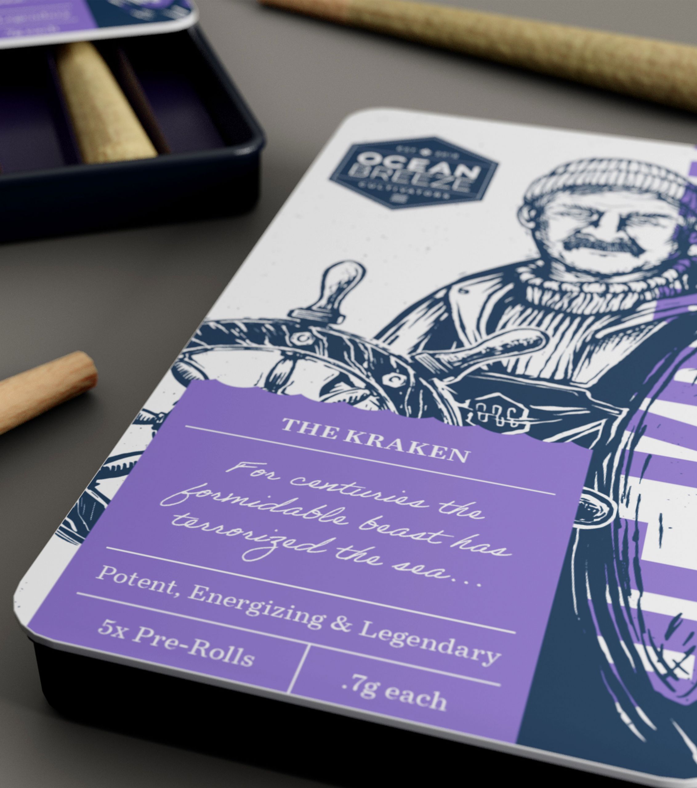
5 ways to maximize the principles and elements of design for product packaging
Not all packaging design is created equal. Certain designs jump out and catch our eye more often than others, but why is that?
Brands who effectively use elements of good design are ensuring that their packaging feels balanced and strong by looking carefully at how the visual components interact with each other and the piece as a whole. By looking at each piece, we can determine if aspects of the package are competing with each other and taking away from the overall message of the product.
Each principle on their own can be a powerful tool for designers but when they are used in conjunction with each other a more cohesive story can be told.
In this article we will go over what the principles of design are, how to use them in your packaging designs, and ways that you can take your designs to the next level by maximizing elements of good design.
What are the principles of design?
The principles of design are the backbone of graphic design. They are the things that give components of a design reason.
While graphic design is still a uniquely creative process, by utilizing these principles designers can ensure that their finished products are cohesive and focused. They help to create a structure to the design where all of the elements feel balanced.
This might sound a little vague right now so let’s jump into the nitty-gritty of what the principles of design are:
Balance
When we talk about balance within a piece of design, we are looking at the distribution of visual weight of the elements. Visual weight accounts for how much an object attracts the eye in a design. A designer could be working with space, color, texture, lines or objects to establish a sense of balance.
This balance can be created in a couple of different ways. The simplest way to accomplish this is through symmetry of the elements, where both sides are exactly the same and thus have the same weight. We can also use radial symmetry, where objects are focused around a central point.
And lastly there is asymmetrical symmetry, where each side looks different but still feels balanced. What we mean by this is that one side could have a more prominent focal element that is offset by a couple secondary graphics on the opposite side. Although they don’t look the same, by having a couple of smaller elements opposite a larger one it creates movement while maintaining the visual weight of the piece.
Emphasis
Emphasis is when the design creates a clear focal point. As you can see I did that right there by having the words “focal point” bolded. I was able to attract your attention to those words by creating a more stark contrast with the words surrounding it.
In design we are able to do this with more than just bolded text though. Emphasis can be created through differences in color, size, texture, or shape.
Movement
This has to do with the flow of a piece. What journey does the design take the viewer’s eye on. Is there a hierarchy of elements that they move their way through?
Movement is important in your design because it’s what allows you to guide the viewer’s eyes to key pieces of information. In packaging this is key in ensuring that consumers understand the unique features of your product.
Pattern
One of the more straightforward principles, pattern refers to the repetition of objects across a design. Patterns add texture and depth to a design that can add to the visual story of a piece.
Repetition
While repetition can be used within a pattern it is also used when a shape, object, texture is used multiple times within a design. It not only adds movement to the eye but it also helps to justify certain visual components of a design to make them feel purposeful.
Proportion
Proportion has to do with the size of an object relative to the others in the same piece. This is most obvious when thinking about proportions of the human form; how large someone’s head looks compared to the length of their torso, etc.
Rhythm
This combines aspects from pattern, movement and repetition. Rhythm is used to create organized movement in a design.
I like to think of rhythm in terms of visualized music. What this means is that you can almost feel the beats and movement of the piece like you would in a song. And much like music, it has a repeating pattern to the notes. So in design this might include multiple principles working together, usually in some kind of pattern or repetition, to add a feeling of motion.
Variety
If everything in your design looks exactly the same it might feel dull and lifeless. Variety gives a piece added character by highlighting the differences in elements. For example, variety can be added to a piece by having contrasting colors, textures, sizes, shapes, or lines next to each other within a composition.
When a piece has too much variety it can look busy and distracting, but when done well it can help guide the eye and add to the emphasis of design.
Unity
Unity looks at how cohesive elements look together. How well are the different elements and principles working together to make the piece feel like one design. Unity is important in making sure your design is coming together as a singular unit.
If one principle is too strong the piece might feel off balanced or like it’s competing with the rest of the design. Unity looks at all the elements as a whole to determine if they are being used well and cohesively.
5 brands that maximize elements of good design
Like other forms of graphic design, packaging thrives off of utilizing the principles of design to their fullest potential.
Let’s look at five brands who have maximized how they use principles of design when they rebranded their products. By looking at these examples we can see how applying things like asymmetrical symmetry and unity can elevate a package to the next level and help it to stand out against competitors.
Chobani
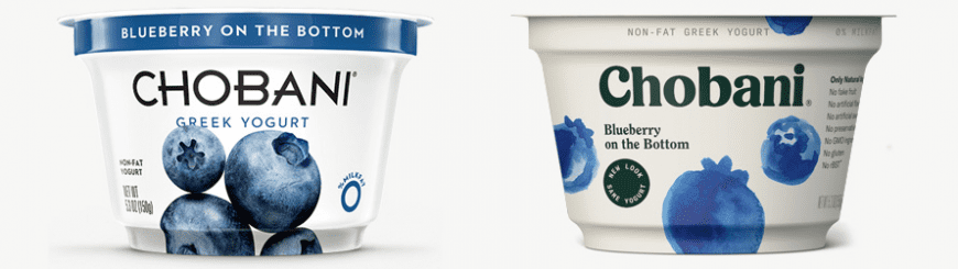
Chobani’s rebrand is one of the most iconic in the food industry. But what made their updated packaging so successful and why is it more pleasing to the eye than the original. Let’s break it down into its components.
The updated packaging has more movement with the fruit being dispersed across the front of the container. The repetition of the watercolor blueberries gives the piece a sense of unity and allows for the consumer’s eye to move across the packaging to grasp all of the information provided. Emphasis was added through the change in the font of the Chobani name. It’s bolder which commands the eye more putting the focal point there instead of the fruit on the bottom.
There is also a clearer balance between the elements of the new design. In the original the fruit’s visual weight overpowers the upper half of the package which pulls away from the Chobani name.
Not only is the new packaging a more modern look with added space between the elements but the overall emphasis and balance is restored to better highlight the key product features.
Black Birch Vineyard
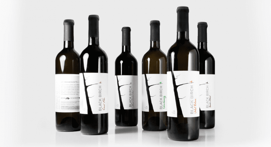
When Black Birch Vineyard came to BRIGADE looking to update their wine labels and branding, we wanted to highlight their craftsmanship as well as the organic nature of their name. We knew that the black birch tree had to be a focal point of the brand so we designed a die-cut label that embraces the tree in a wonderful way through that negative space.
The thing that brings this design to life is the way in which balance is used so well to offset the weight of that tree silhouette. The text on the right side perfectly juxtaposes the dark silhouette. Emphasis is added through the use of bold colors on the bird and type of wine. With the subtle slant of the tree, movement is added to the piece that brings the eye down from the top of the label to the text on the right side.
This bottle goes to show that even with a minimalist design, these principles can elevate a piece and ensure that proper balance is created.
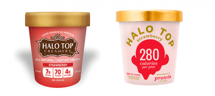
We’ve all seen that recognizable golden Halo Top lid and 280 calorie call out. But most people haven’t seen what their packaging looked like before their well known redesign.
On their original packaging on the left, there is less contrast between the background and call-out colors which doesn’t provide as much emphasis as they’re able to create in the new packaging. With more pastel colors for the background on the updated design, Halo Top puts all of the focus on their top selling point of their product being 280 calories.
They’ve also added movement to the design by having the ice cream scoop have a subtle drip to it. All of these bold, contrasting changes give Halo Top’s packaging a strong focus on what their product is and why it’s different from the competitors.
Atlanta Brewing Co.
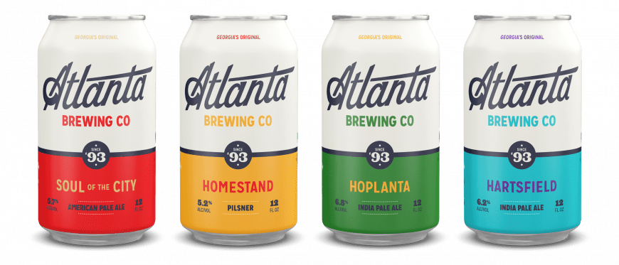
Atlanta Brewing Co.’s updated beer cans showcases how contrast in the elements of design makes the design pop. A focus on color creates emphasis on the type of beer while also balancing how large the logo typeface is. The original design had more competing textures throughout which made it more challenging to discern what to look at first.
By creating a more defined hierarchy of elements the design and information is easier for the consumer to understand.
Energizer
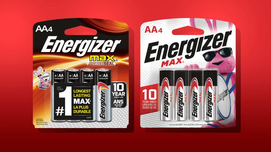
These principles aren’t just used in food and beverage packaging, though. Take a look when you’re walking around a convenience store at what elements are catching your eye in a design, how are shapes moving across the package.
Energizer simplified but emphasized their battery packaging. The thing that jumps out the most is the use of scale with their iconic energizer bunny. By adjusting his proportion to the batteries he is given more importance and adds character to the design.
The original package also uses more variety in the shapes and textures of the graphics which causes it to appear busier and less focused on what the pertinent information is. With the new design, the background has a simple line pattern repeated that adds subtle texture without taking away from the text on top. Our eye is brought to the red call-out on the left due to the contrast in color from the background.
By toning down the way in which the principles of design were utilized, Energizer was able to focus consumers’ attention on the most important information and display a clearer product story.
How to apply these principles to your packaging
Now that we’ve seen how the elements and principles of design can be applied to varying packages it’s time to take your products to the next level. Choose a couple of the principles to focus on in your updated packaging.
Emphasis is an easy one to start with by first determining what information you want the consumer to pick up on first. Adjust the scale or color to make these elements jump off your package. Play around with patterns like Energizer does in their battery packaging that adds subtle interest to the background.
If you need additional support in adding the principles of design to your new packaging designs, reach out to BRIGADE for a consultation.