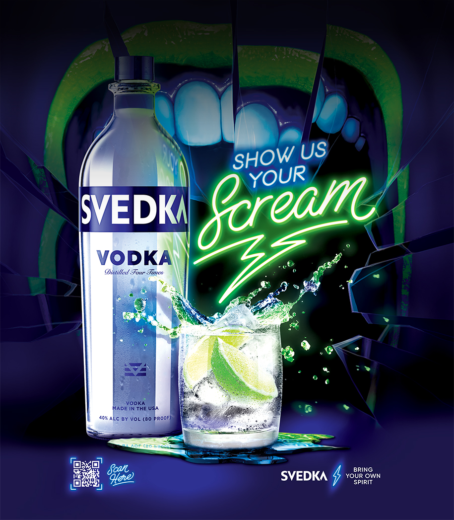
Collaboration
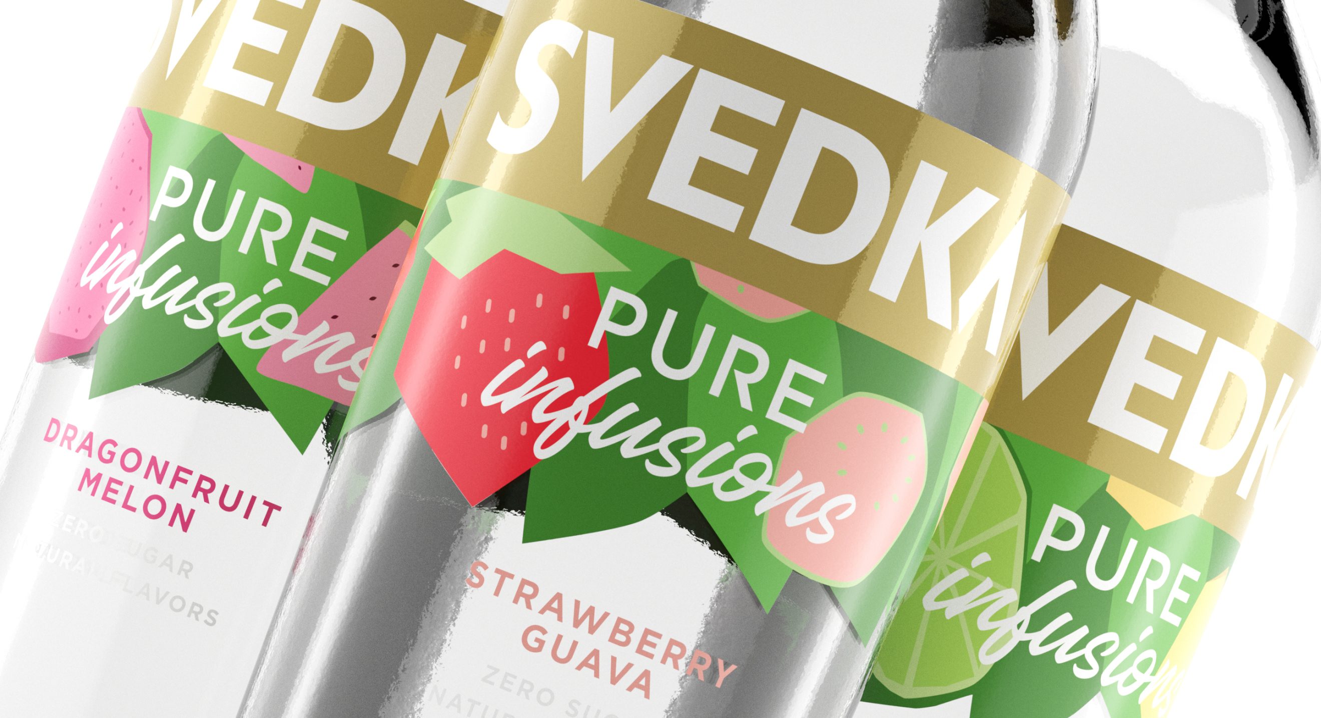
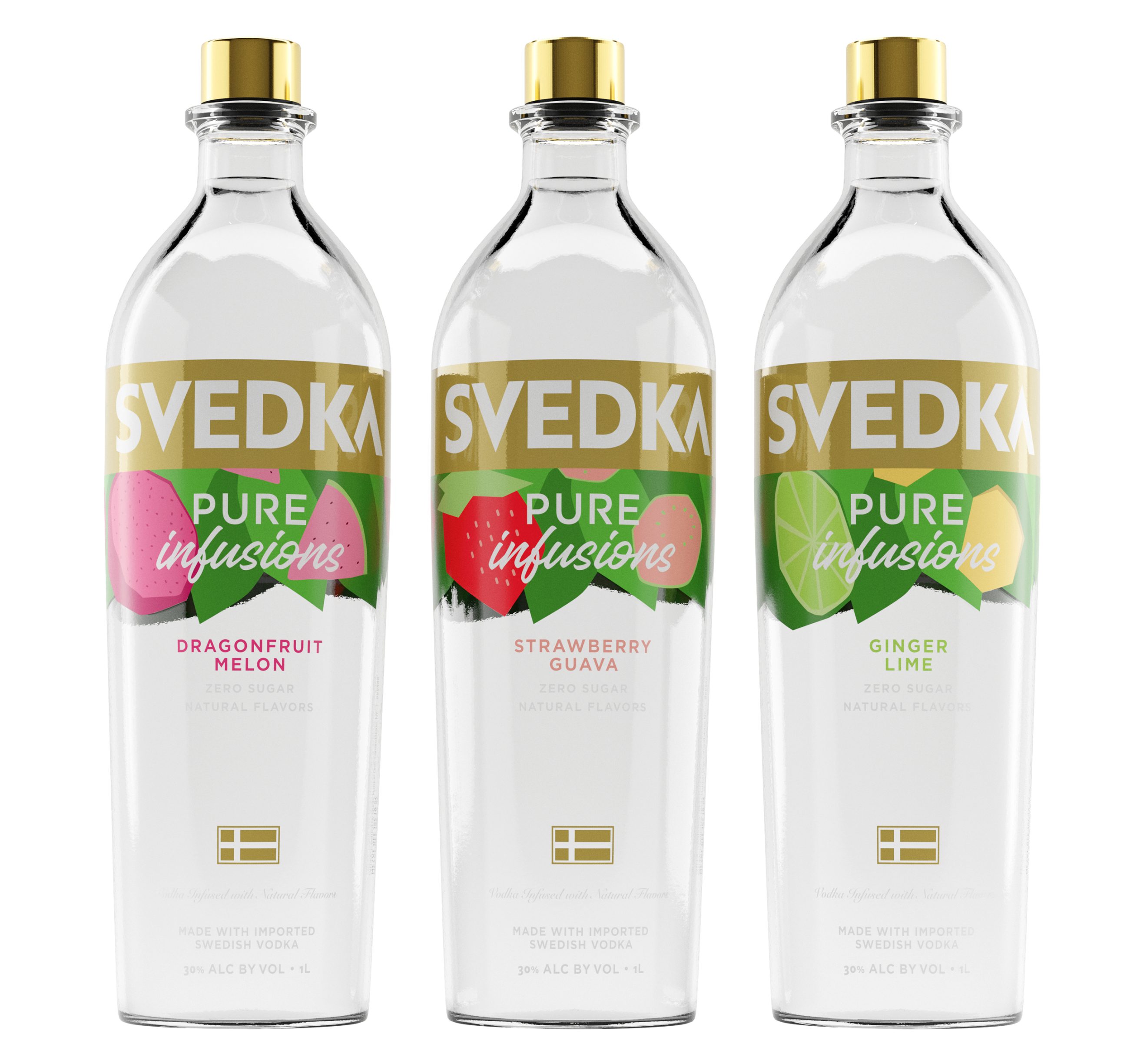
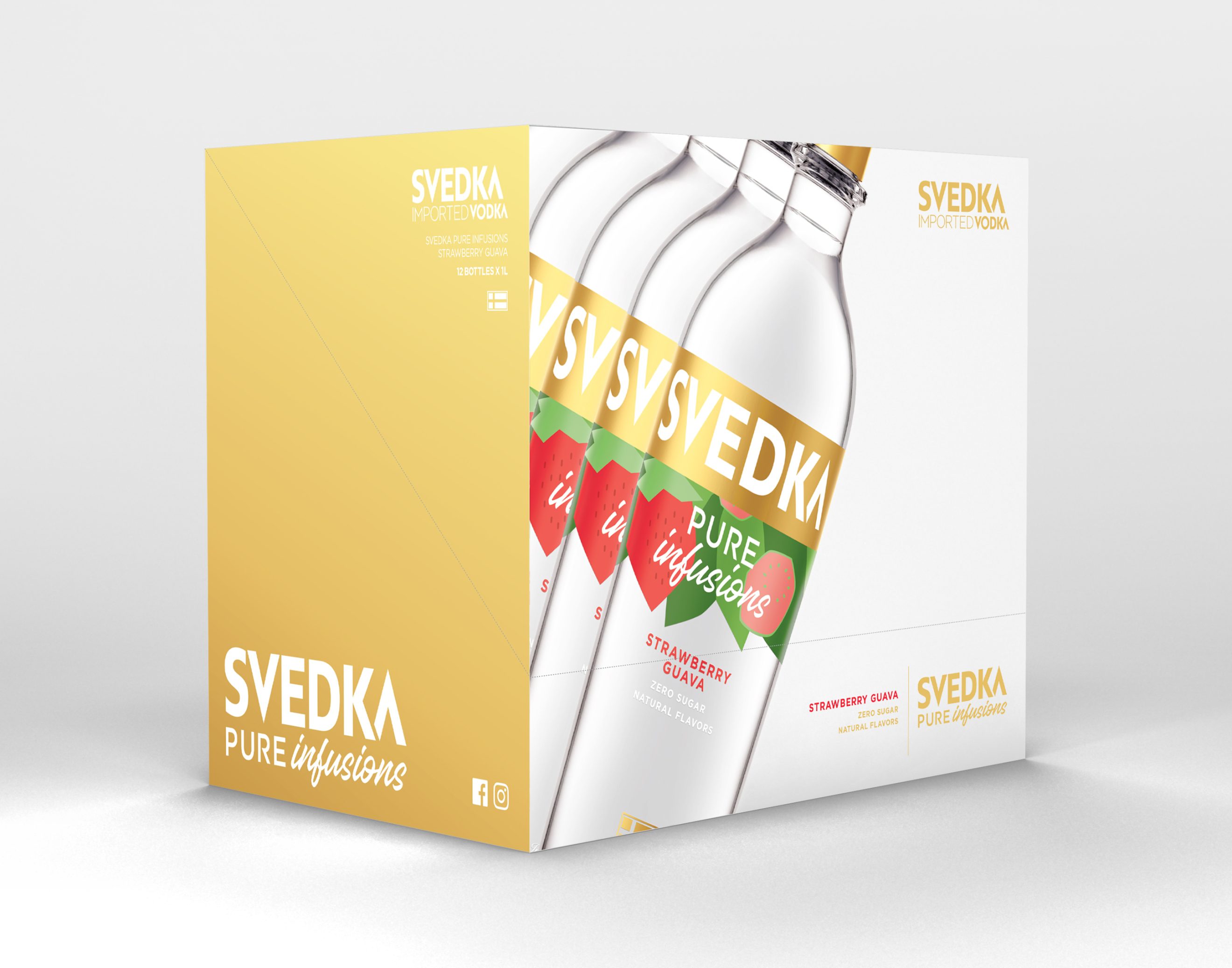
SVEDKA approached us to design packaging and launch materials for their first sub-brand and biggest product launch ever—SVEDKA Pure Infusions. This lineup of 3 flavors is betterment-focused with real ingredients, no sugar, and big flavor. It is also SVEDKA’s first premium-priced offering.
Approach
We created custom, minimalist fruit shapes inspired by shapes in the ‘SVEDKA’ logo. Fruit graphics are grouped around a gold SVEDKA logo band to make it look like fruit is floating in the liquid–a nod to naturally infusing vodka and homage to the name ‘Pure Infusions’ and the betterment category itself. Final packaging used matte gold with raised, baked-on ceramic inks for premium hand-feel.
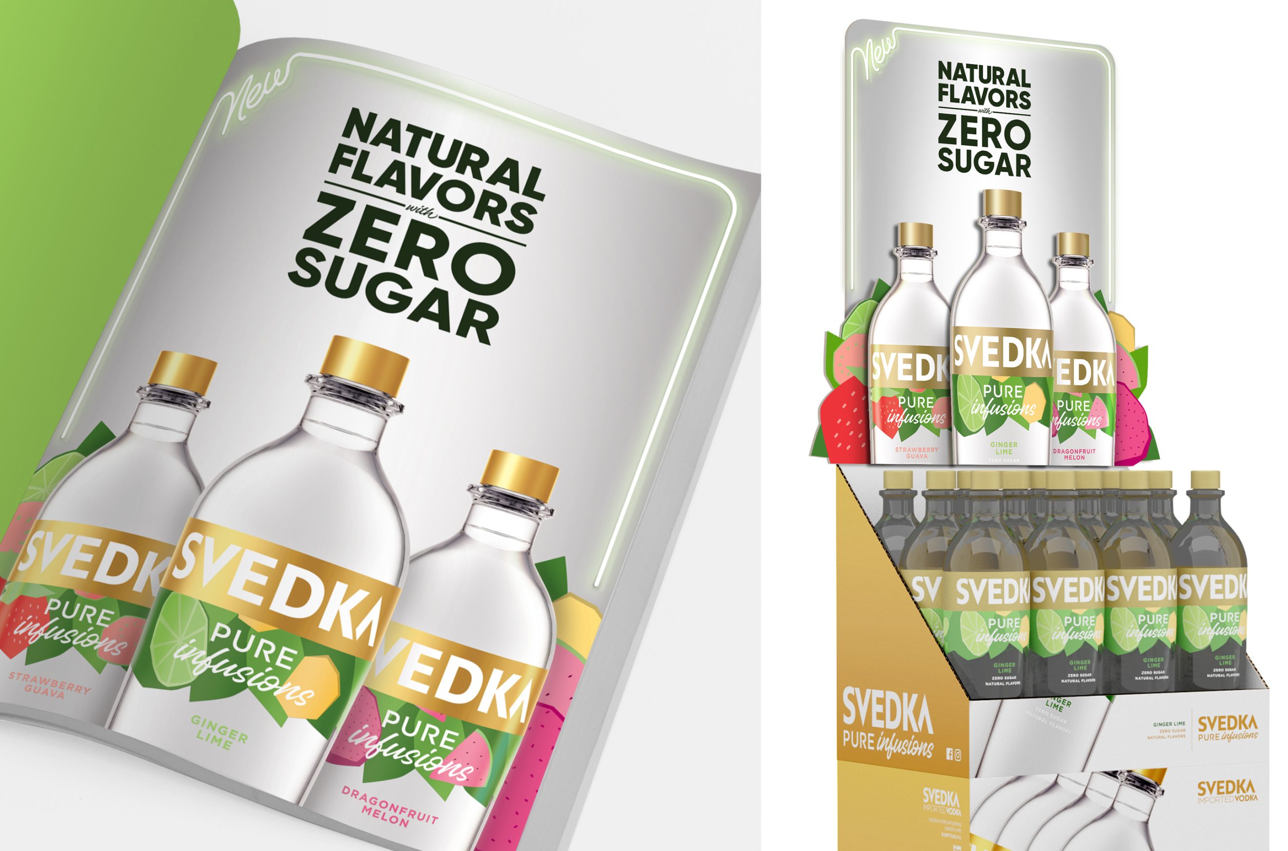
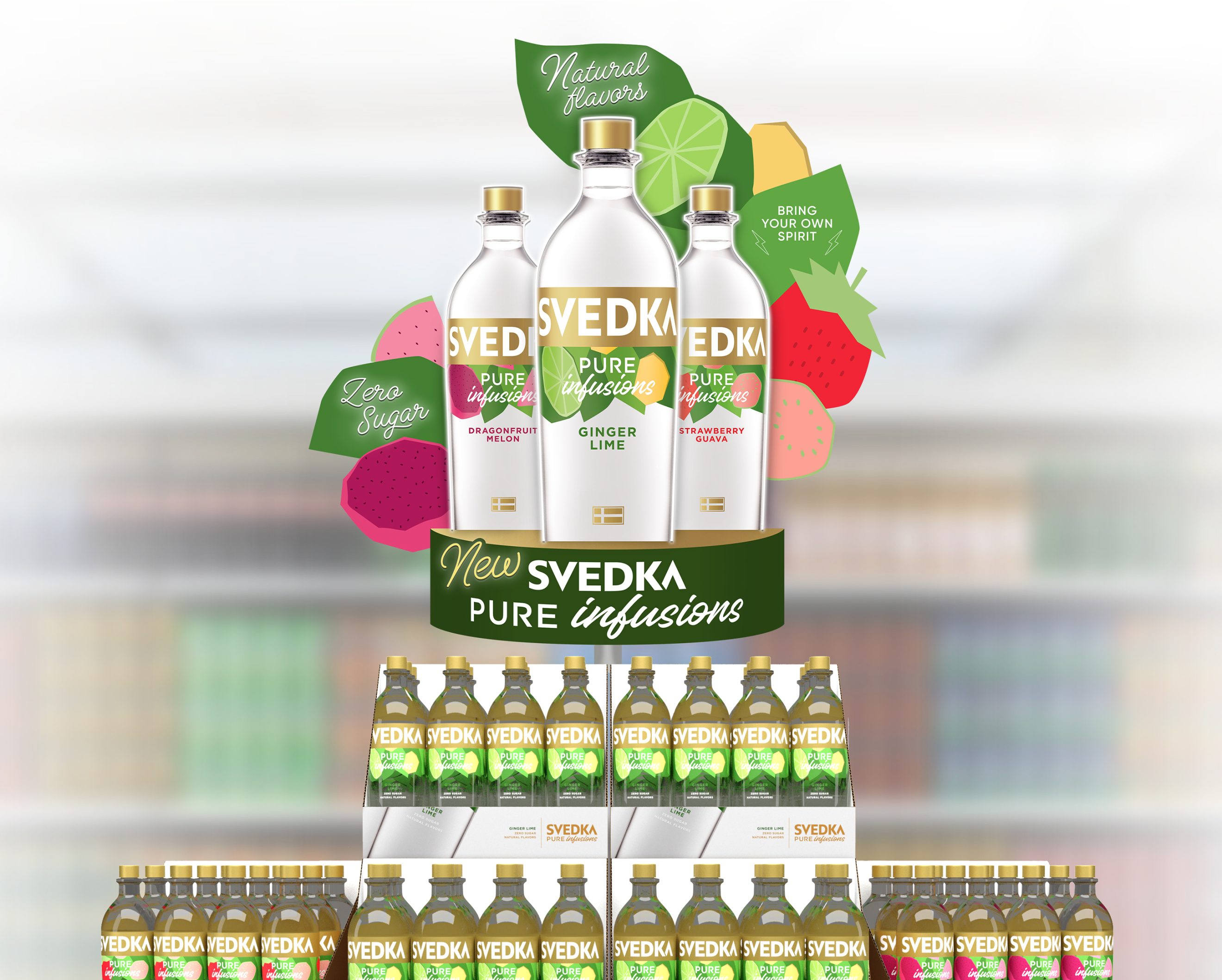
For launch materials, we were asked to create clean, betterment-adjacent point of sale that would remain consistent with the brand’s neon-aesthetic and dark ad-campaign. We emphasized Pure Infusions’ betterment-focused ‘no sugar’ differentiators and used color to cue clean and premium; the use of white neons and minimal white space supported betterment and paid off the concept of ‘Pure’, whereas we supported the idea of fruit ‘Infusions’ by surrounding the bottles with fruit graphics to speak to flavor and appetite.
This does not constitute an endorsement of any kind.