
Designing websites for all (why accessibility matters)
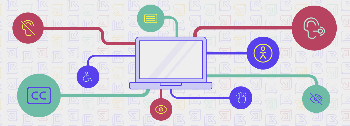
At BRIGADE, one of the capabilities we offer our clients is the knowledge and ability to design and build fully-accessible websites.
Wondering why that’s important?
We’ve all experienced it: waiting for a slow-loading website, squinting at a poorly-designed font, or trying to navigate a mobile-unfriendly page. While these problems may be a slight inconvenience to many of us, for people with disabilities, they can completely restrict internet use.
According to Wikipedia, web accessibility is the inclusive practice of ensuring there are no barriers that prevent interaction with, or access to, websites by people with physical disabilities, situational disabilities, and socio-economic restrictions on bandwidth and speed. Integrating accessibility can seem intimidating to those that are just getting acquainted with it, but it is a vital element of user experience.
According to the World Health Organization’s (WHO) 2011 world report on disabilities, 15% of the world’s population possesses some sort of disability. This includes physical disabilities, as well as cognitive and neurological disabilities. Rates of disability are only set to increase due to population aging and the increase in chronic health conditions.
So, how does this affect you?
Besides making the internet a more inclusive place for everyone, we believe that a good accessibility strategy also has business benefits. Accessible websites have better search results, reduced maintenance costs, and increased audience reach. Having a well-designed, accessible website can significantly improve the user experience for all users of your site – not just those with disabilities.
Here are some guidelines to ensure that the interface and development of our clients’ sites are created for accessibility.
1. Add enough color contrast. Color contrast is an often overlooked web accessibility problem. People who have low vision could find it difficult to read text from a background color if it has low contrast.
2. Don’t use color alone to make critical information understandable. Relying on color alone to communicate information causes barriers to access for many readers: colorblind and low vision users may not be able to perceive the color differences, and screen readers do not announce colors to non-sighted readers.
3. Design usable focus states. Focus indicators help people know which element has the keyboard focus and help them understand where they are when navigating your site. These are used by people who are blind and require screen readers, individuals with limited mobility, individuals who have suffered injuries like carpal tunnel, and power users who prefer this type of navigation.
4. Use labels or instructions with form fields and inputs. Using placeholder text as labels is one of the biggest mistakes when designing a form. Form labels are especially important because they’re read by a screen reader when a form field receives focus. A sighted user might see three fields for an address and reasonably assume that all three fields should contain a portion of their address, but a person using a screen reader won’t have the visual clues to come to that conclusion.
5. Write useful alternative text for your images and other non-text content. Alternative (Alt) Text is meant to convey the “why” of the image as it relates to the content of a document or webpage. It is read aloud to users by screen reader software, and it is indexed by search engines.
6. Use correct markup on your content. Semantic markup affects the accessibility of a page. A sighted user may not notice that a web page is marked up semantically, but those using assistive technologies will. Screen readers, for instance, will discern the hierarchy of the document via the HTML markup so it can pass the content along to the user. If heading tags are used incorrectly, or lists aren’t tagged as such, it can make it difficult or impossible for a user to understand the page, or find what they’re looking for.
7. Support keyboard navigation. Many people use only the keyboard to navigate websites — either through preference or circumstance. Be careful with the size of your navigation — this includes the number of links and the length of the text. Tabbing through long menus may be demanding for people with motor disabilities, and listening to lengthy links can be cumbersome for people that use screen readers.
As designers, it is our responsibility to champion accessibility. With it, we make technology usable to all people regardless of their abilities, economic situation, age, education, or geographic location. And at the end of the day, designing with accessibility in mind makes the user experience better for everyone.