The Role of Color in Boosting Memorability and Market Share
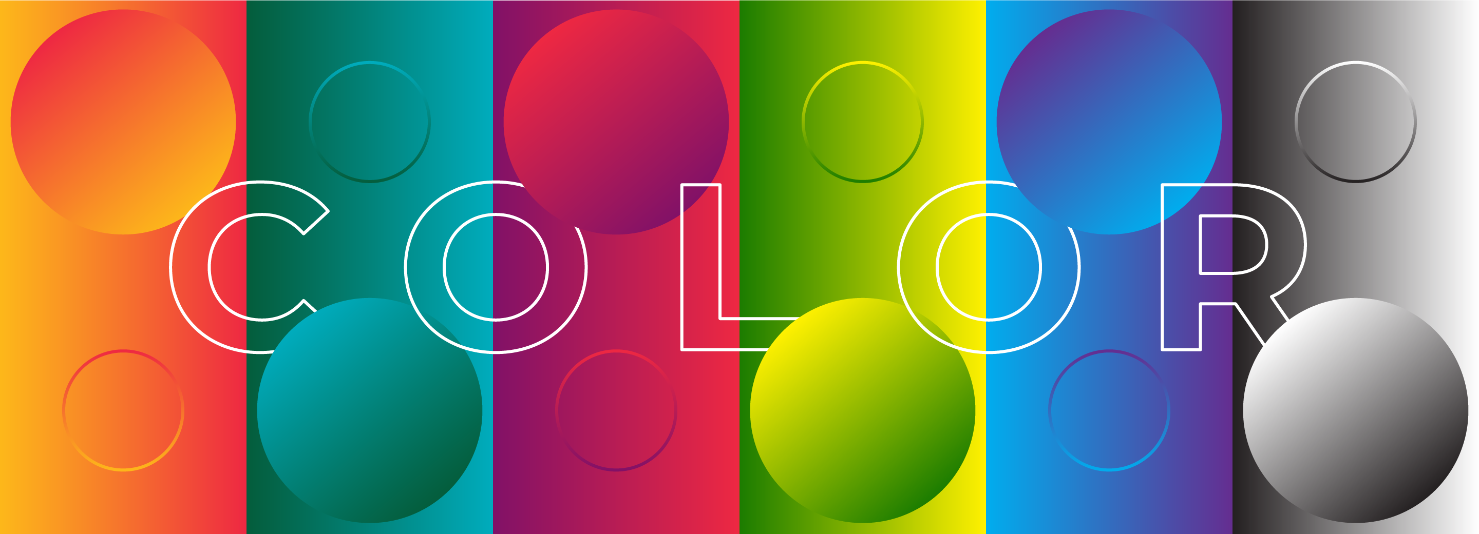
Red makes you hungry. Yellow uplifts you. Green connects you with nature. Color has a profound impact on our mood and the psychology behind it is well-researched.
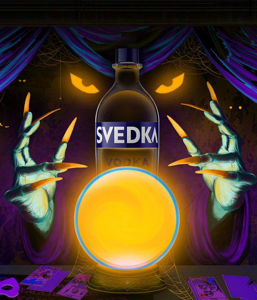
When you consider the science, it’s not surprising to learn that 77% of chain restaurants use the color red in their branding (think McDonald’s, Pizza Hut, and Jollibee). What better way to get you in the door than using a color that can invoke a sense of urgency and excitement, as well as stimulate your appetite? You’re already imagining your next meal, aren’t you?
Research suggests that color can influence up to 85% of shoppers’ purchasing decisions, and thus, a recognizable color palette can increase brand awareness and memorability.
There are many examples of brands that have effectively used color to establish a strong brand presence. Tiffany & Co has registered their iconic “Tiffany blue”. Greta Gerwig’s Barbie film wiped out Rosco’s entire worldwide supply of pink paint in 2022. After a long legal battle, UK chocolate brand Cadbury was granted a trademark for its distinctive purple, originally chosen by the brand over a century ago as an homage to Queen Victoria.
Colors can become synonymous with brand recognition and create a long-lasting impression on our cultural zeitgeist, sometimes even informing the public’s perception of those colors.
Finding a Balance
It’s important to consider your market when making color decisions and what helps your brand stick out among the rest while still feeling appropriate. Let’s say the product your company sells is bottled water. Most bottled water is packaged in blue, because it is the color we associate with water. If you were to design your bottle label using colors like orange, purple, or brown, that might throw off some consumers.
Contrarily, our brains are more likely to remember things that stand out from the crowd. A great example of competitive differentiation and out-of-the-box color thinking is the canned water brand Liquid Death. Their can designs more closely resemble those of craft beer labels with their use of white, black, and gold. Because of this, it’s a natural transition for them to dive into the world of soda and iced tea. Liquid Death is helping us reimagine what packaged water can look like while simultaneously criticizing the industry for the waste that plastic creates.
There are other cases where using an unconventional color could attract a buyer more than a color that floods that particular market. For instance, many health food brands use green in their packaging to reflect eco-consciousness (sometimes to a fault–check out our past academy article about greenwashing here), so using a different color could help draw the eye of shoppers with a “no bullsh**” approach to clean eating.
Crafting eye-catching aesthetics in your packaging and beyond can increase customer memorability and loyalty, but know how to use it wisely. It makes sense for tech companies to lean into a more subtle palette of whites, grays, and blacks. These colors are associated with simplicity, stability, and power, respectively. Whereas if you are marketing a product for kids, it’s smarter to lean into more vibrant colors that grab the attention of little eyes.
Don’t Be Afraid to Play
Color is a very fun thing to explore when crafting a brand identity. Color can invoke different feelings in everyone and can be perceived differently by people of different genders or cultural backgrounds. Research is your friend here. Dive into the psychology and theory behind color when making considerations for how your brand will be perceived by your target market. To go deeper, you could even trial what color scheme works for your brand by A/B testing or collecting user feedback.
There has been a rising trend of folks discovering a preference in maximalist aesthetics these days, which is unsurprising. We’ve been living in an era of very little color when it comes to product design, tech, and even how we decorate our homes (I think we can all agree that “Milennial Gray” has overstayed its welcome). Now is the time to lean into more colorful palettes and bring some joy back to what we consume.
At BRIGADE, we create distinctive brands. Leaning on our expert knowledge of color theory, we help to boost memorability and market share for brands in CPG, Health and Wellness, Hospitality, and other industries. Take a look at our recent work for the new Echo Suites by Wyndham Hotels. We used calming shades of green, off-white, and charcoal, with hints of blue and gold. The palette invokes a connectedness to nature’s beauty and the textures we see around us. These colors were then used to inspire the design of the hotel and its rooms, to keep that sense of tranquility throughout the entire experience for the guests.

Our Takeaway
There are no new colors that the human eye has yet to discover because our eyes are only sensitive to particular wavelengths. Yet, every day brands find new ways to utilize color in a way that captures the attention of new consumers. It’s a powerful tool to wield, and when done wisely can greatly boost market share. The world is a canvas and we are the paintbrush, so let’s make it beautiful.