Challenge
Seismic Brewing, a Northern California craft beer pioneer, tapped us to develop a redesigned packaging system that would communicate their revolutionary sustainable brewing practices and change the way consumers spotted them in retail.
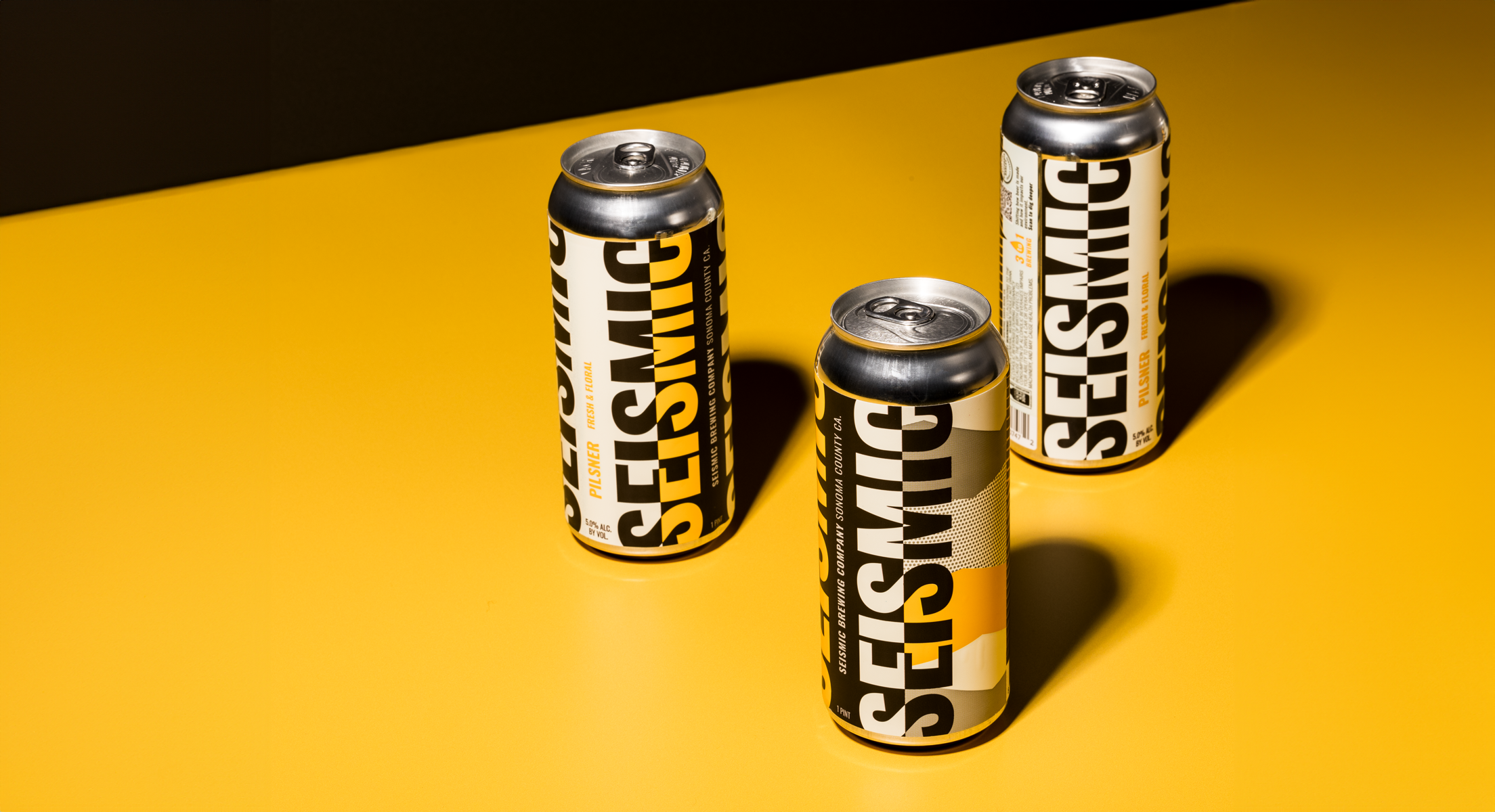
Solution
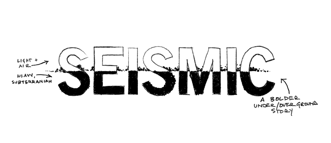
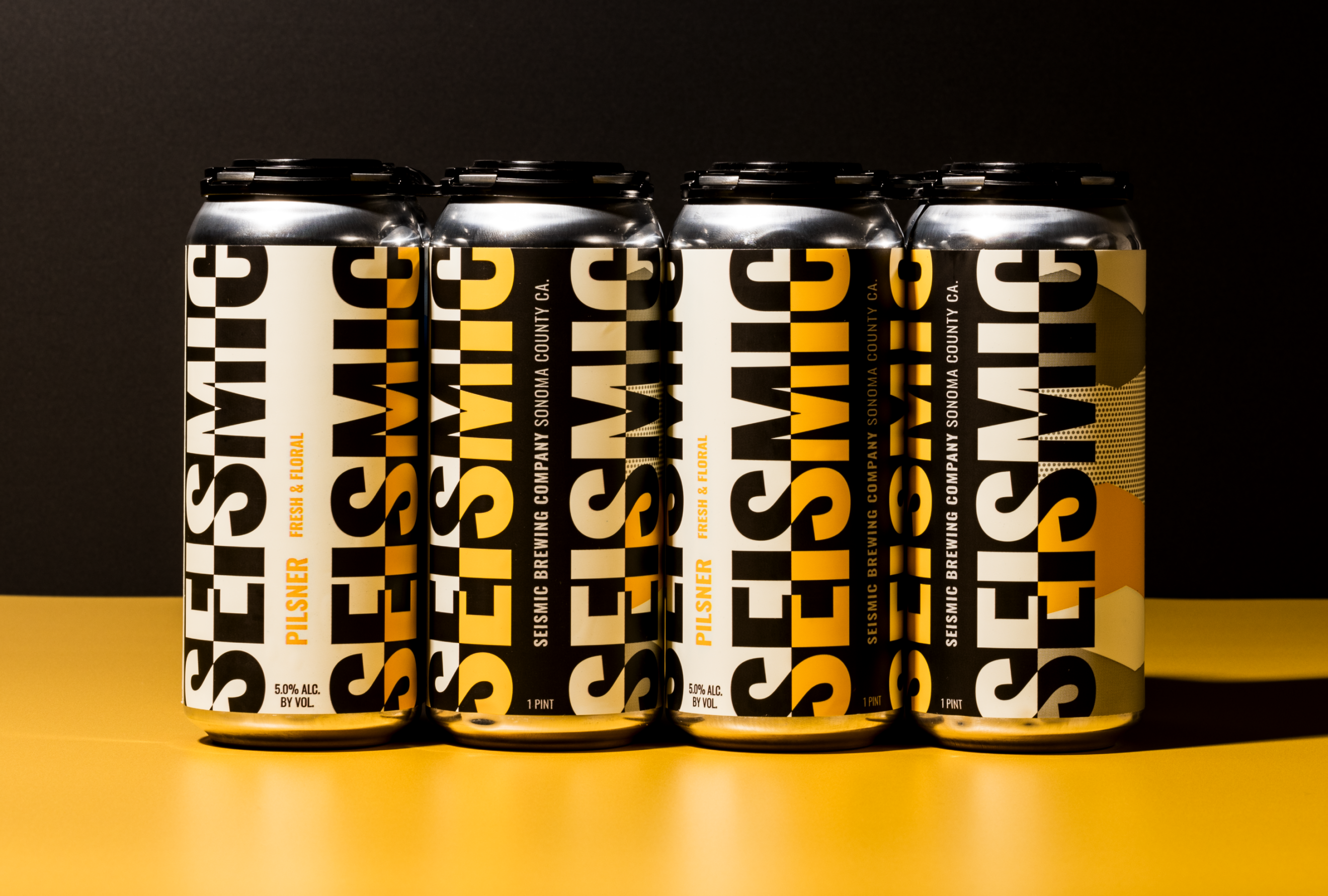
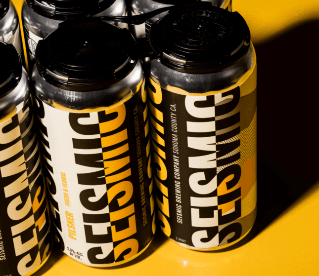
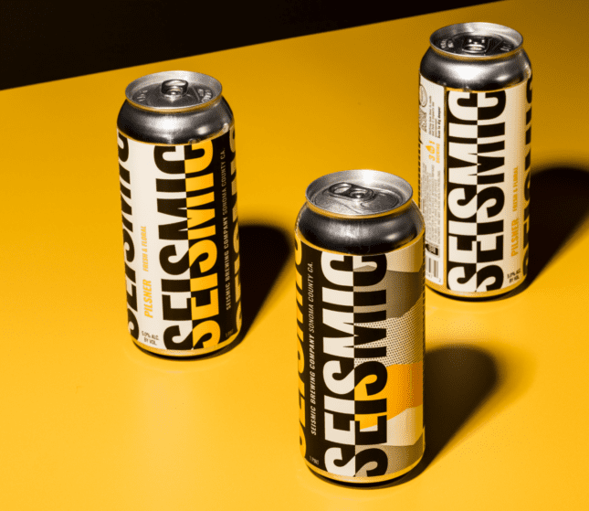
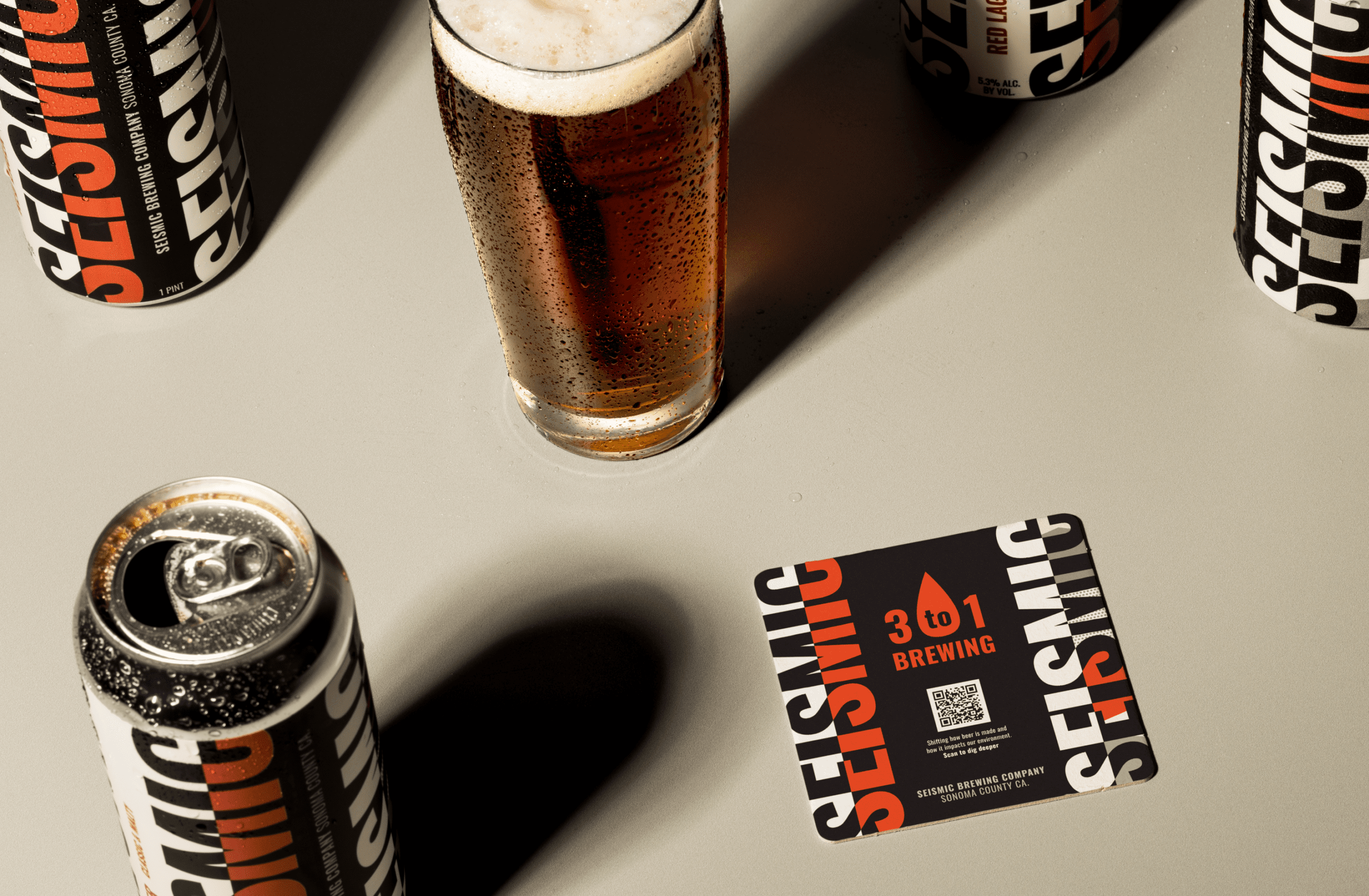
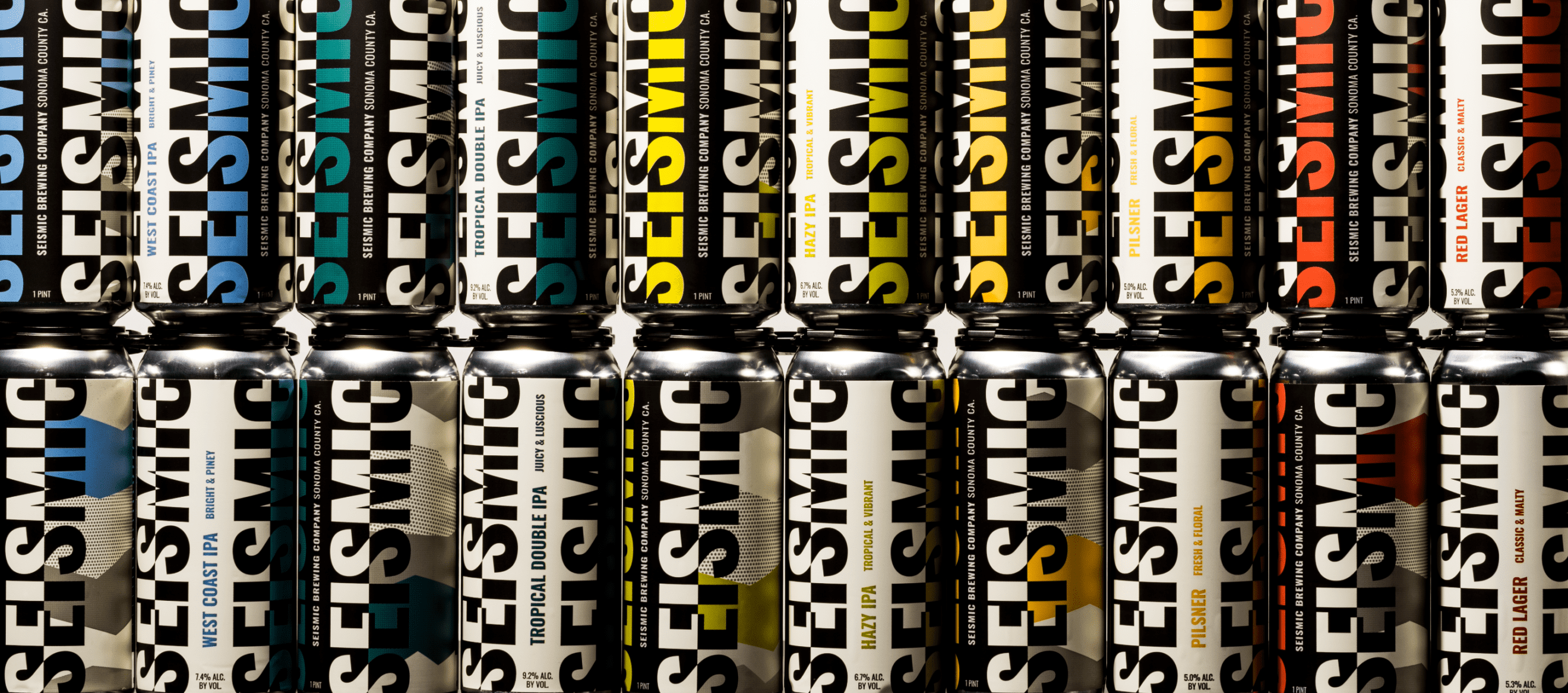
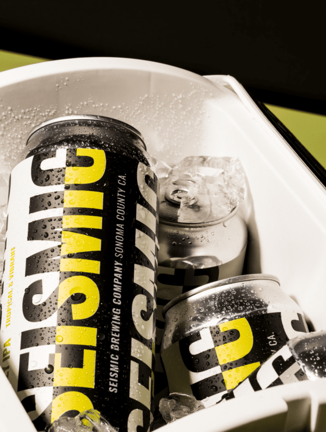
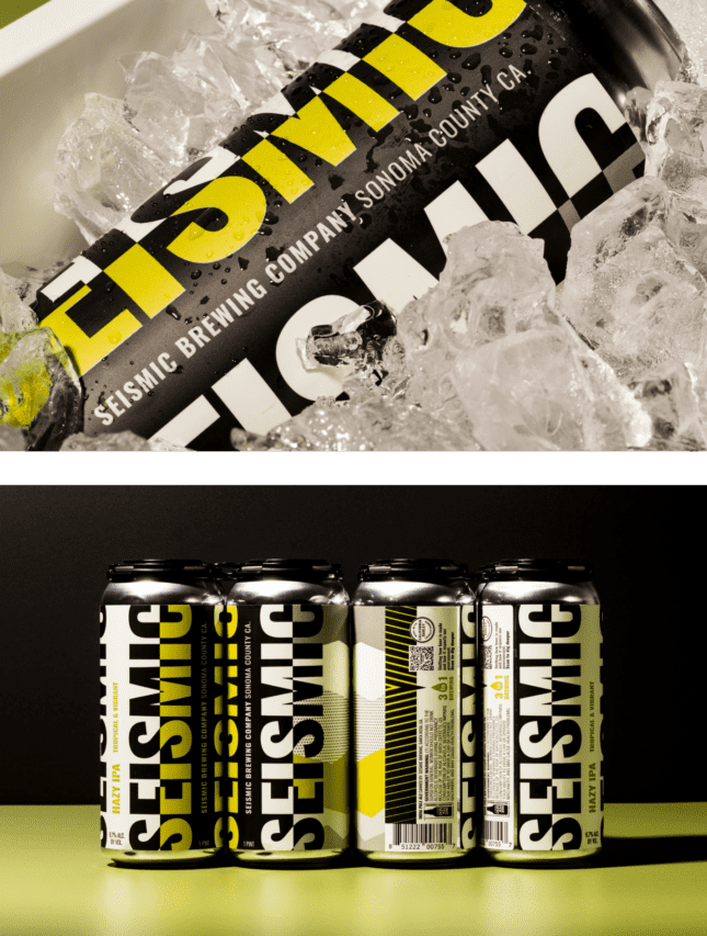
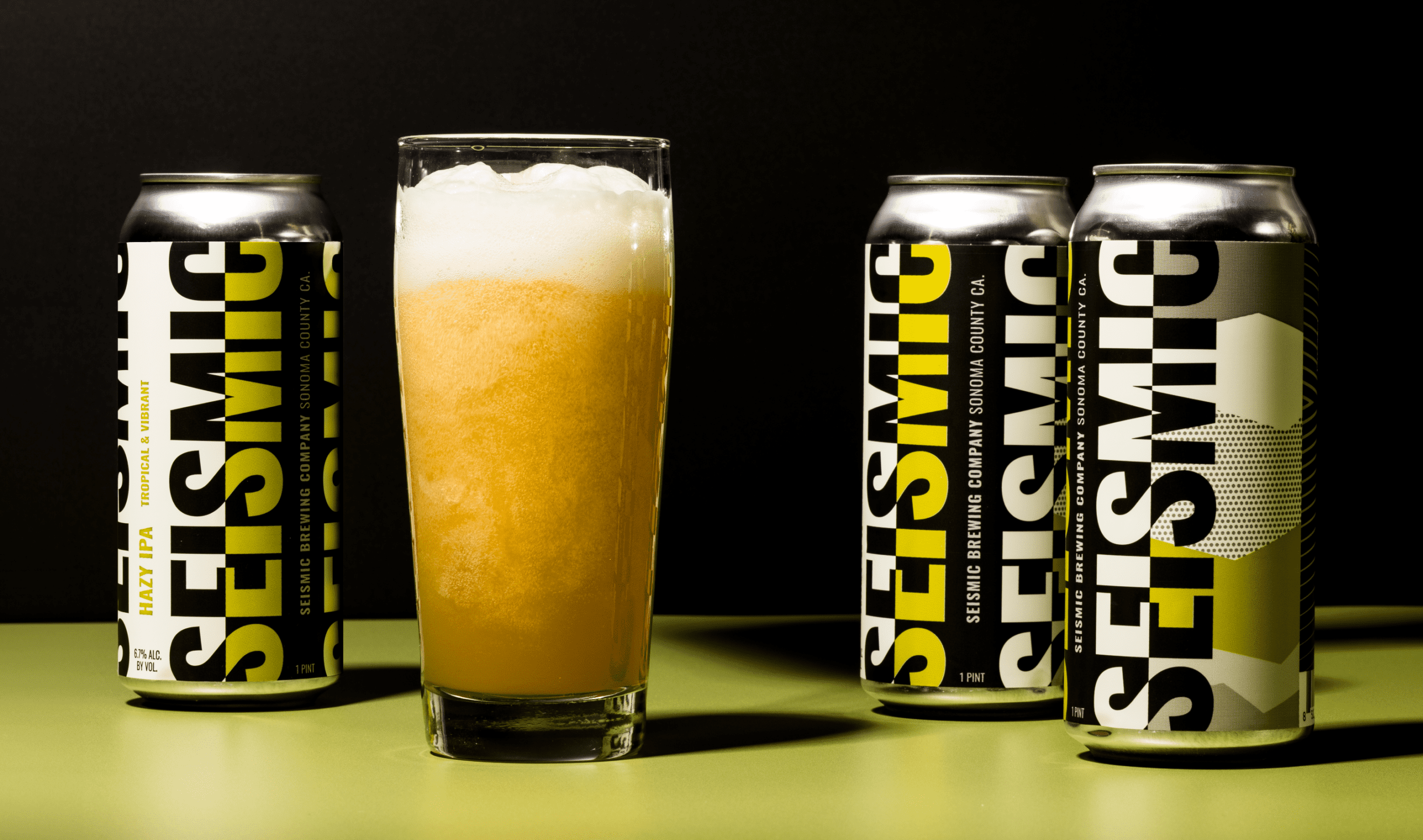
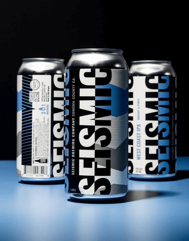
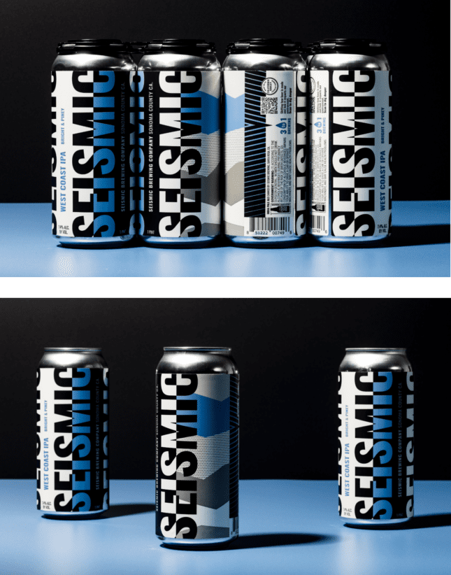
Avoiding the negative connotations associated with California earthquakes, we flipped the script and generated seismic movement through the lens of colors and patterns, creating “hot spots” on shelves with the power of optical illusions. They introduced a billboard effect with a wrap-around label that featured carefully placed black and white elements with strategic, SKU-specific pops of color to create that “vibration” on shelf. The resulting can not only stands out in the visually chaotic, microbrew landscape, it also creates a seamless customer journey (or CX) rich with storytelling using a QR code that invites consumers to “Dig deeper” and learn more about their mission and strategy.