BRIGADE Celebrates Wins in Graphis’ Branding 7

Brigade is recognized by Graphis for work on five distinctive brands.
Every year, Graphis releases several compilations highlighting excellence in design, branding, advertising, photography, and art. This year, we were excited to win four awards and receive an honorable mention in the Branding 7 competition.
Esselon — Gold
Our favorite local coffee roaster helped us bring home the gold in the beverage category. We created a new brand identity and packaging design to take Esselon to the next level. The company was hoping for a clean and refined look, or in their words, “elegance without being elegant.” We were eager to take on the challenge.
Taking inspiration from the Hadley landscape, illustrated the Seven Sisters’ peaks of the Holyoke Range, and the cafe’s agricultural surroundings. We then complemented this work with a series of graphics that evoke Esselon’s homegrown craftsmanship. Bringing this highly local identity to the forefront actually helped us better position the brand to reach a national audience. Since the revamp of their packaging, Whole Foods has picked up the bags nationally, and Esselon’s retail sales have tripled. We’ll raise our mugs to that.
Studio School — Silver
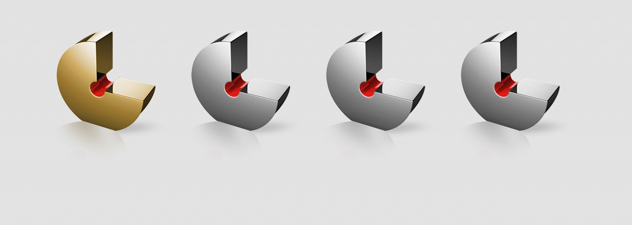
Silver screen, meet silver award. Studio School (formerly known as Relativity School ) came to us for a complete brand refresh to launch their new name. As the first and only college of its kind created in a Hollywood studio, Studio School offers a new generation of creators unparalleled access to hands-on experience in the entertainment industry.
To call out the school’s unique location, we first created a framing logo based on the letterforms L and A (students and staff were pretty excited about it). The typography-based identity throughout the application materials and other collateral featured industry lingo and copy inspiring students to pursue their dreams. Studio School’s new look successfully increased brand awareness around the new name, and the campus graduated its inaugural class in spring 2018. Sequels are definitely on the way.
WorldHotels — Silver
Crafting a logomark and brand refresh for WorldHotels was another rewarding challenge for the team. A global leader in the upper-upscale hospitality space, WorldHotels caters to leisure travellers who prioritize authenticity and local experiences when choosing a hotel.
The new logomark consists of a single line of varying weight, and conveys the idea of traveling the globe in a sophisticated yet accessible manner. We also introduced a contemporary serif and made the W and H larger than other letters in the company name to create clarity for readers and emphasize timelessness and modern luxury. The addition of ‘Collection’ to the logo succinctly captures that WorldHotels is a global fixture comprised of many international brands. With new brand colors, rules, and other visual elements, WorldHotels Collection re-launched their brand at their international conference in Shanghai with an overwhelmingly positive reception.
BRIGADE Portfolio Review — Silver
Designers need opportunities to have their portfolios reviewed, to receive actionable feedback on their work and its presentation, and to network with other creative professionals. To reaffirm BRIGADE as a hub for designers in the Pioneer Valley, we created a unique visual identity for our inaugural portfolio review—to promote online and display onsite on the evening of the event.
We anchored the identity around a collection of black, horn-rimmed glasses raining from the top of the virtual page to the bottom. This movement-based visual literally represents the idea of looking through the lenses at a designer’s work. Online, this element used animation to create movement, with pairs of glasses falling down, piling up, and disappearing to reveal a black background with plain white type. In the print materials, including posters and name badges on-site, we placed the black glasses on a magenta background for a bold and simple aesthetic.
ALHI — Honorable Mention
Associated Luxury Hotels International (ALHI) is a global sales organization providing services for over 250 luxury hotels and resorts, as well as an alliance of cruise ships. Their goal for a brand refresh was to better position themselves in the B2B hospitality space through a contemporary, premium aesthetic and a clarified message.
We redesigned the ALHI logo, leveraging classic serifs and elongated letter forms to craft a timeliness and steadfast mark. We defined a rich color palette of warm and luxurious colors such as Classic Copper, Midnight Navy, and Eggplant. Together, the branding and subsequent collateral evoke sophistication and trust, with luxurious elements, artistry, and style. Adding ‘global luxury sales’ language under the brand logo removes confusion and clarifies their mission. Since re-launching their brand, ALHI has added more than 30 properties and is continuing to grow worldwide.
Learn more about our work here.


