Repositioning a healthcare brand to better reflect their disruptive people-first mindset
- Branding
- Environmental
- Ongoing Brand Development
- Website
- Digital
Beginning with an award-winning rebrand and visual overhaul, we have helped New England’s #1 urgent care brand, ConvenientMD, expand into primary care and build consumer loyalty in a typically transactional healthcare space.

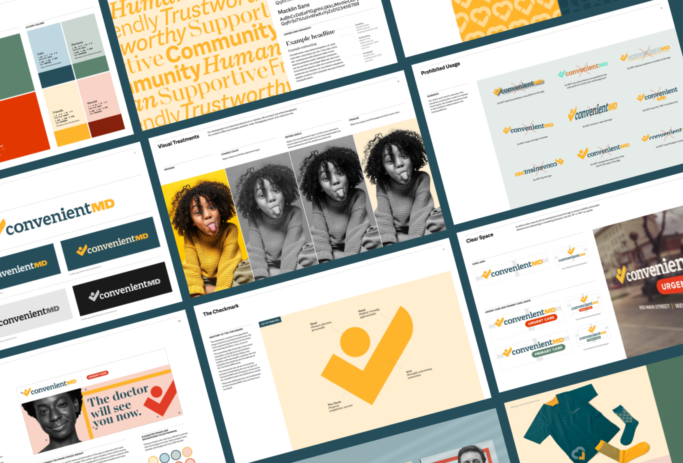
A new identity and mark communicates a friendlier, kinder, more supportive experience. We retain the equity of the original check mark logo and reimagine it with the shape of a person waving. The shape also pays homage to a mortar and pestle or a spoonful of medicine.
Depending on the touchpoint and need, the new logo mark is able to morph into different shapes, icons, and animations.
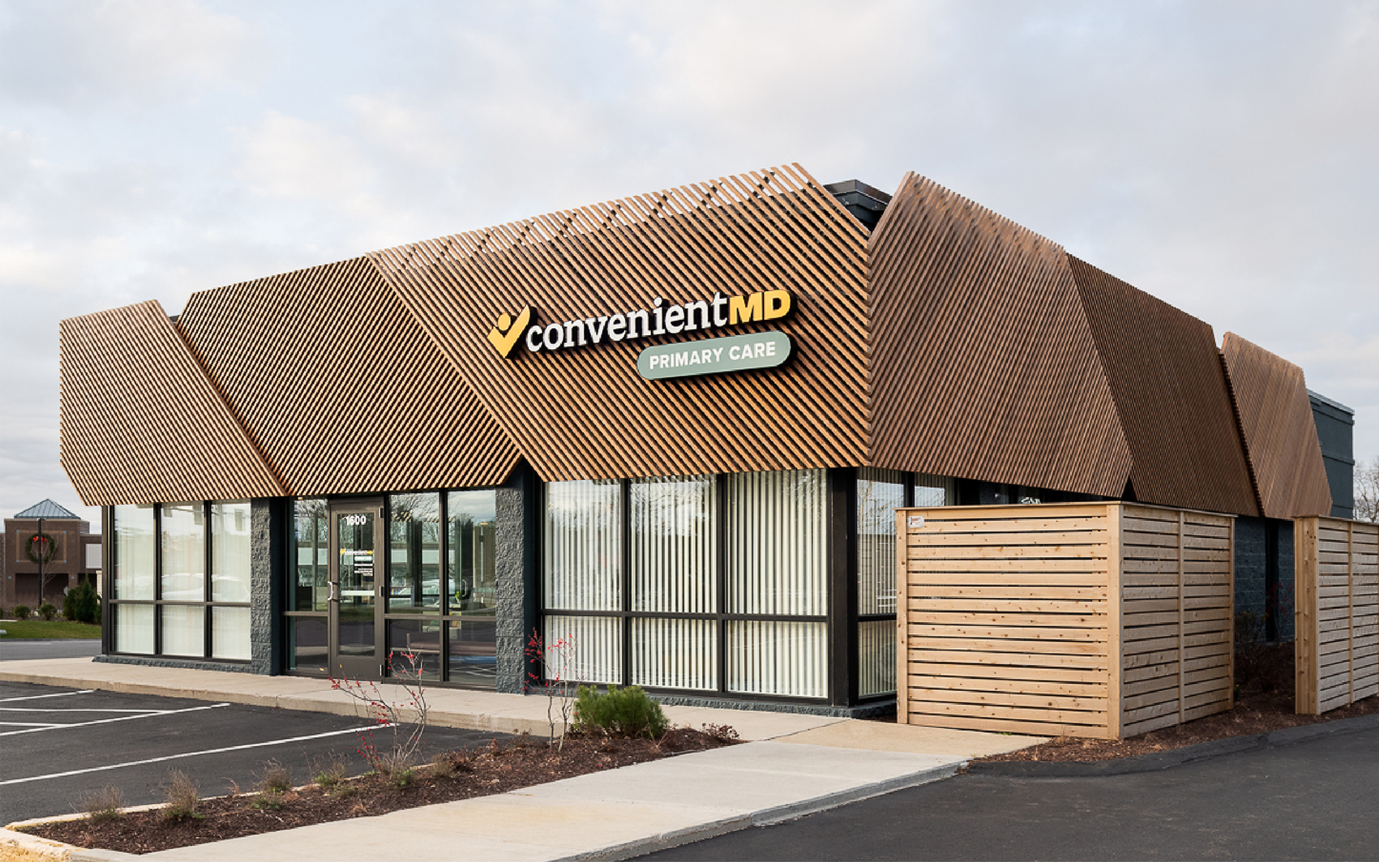
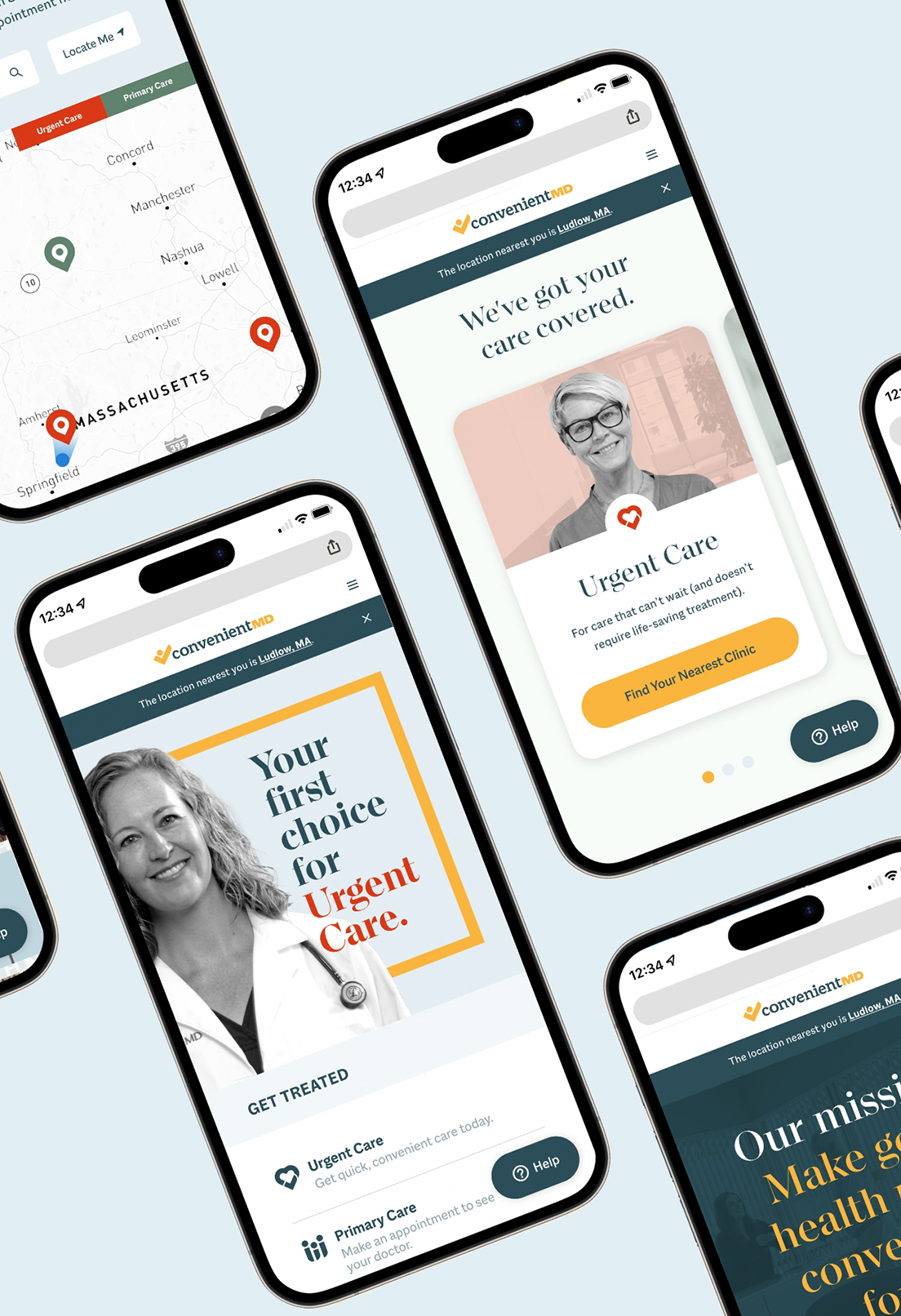
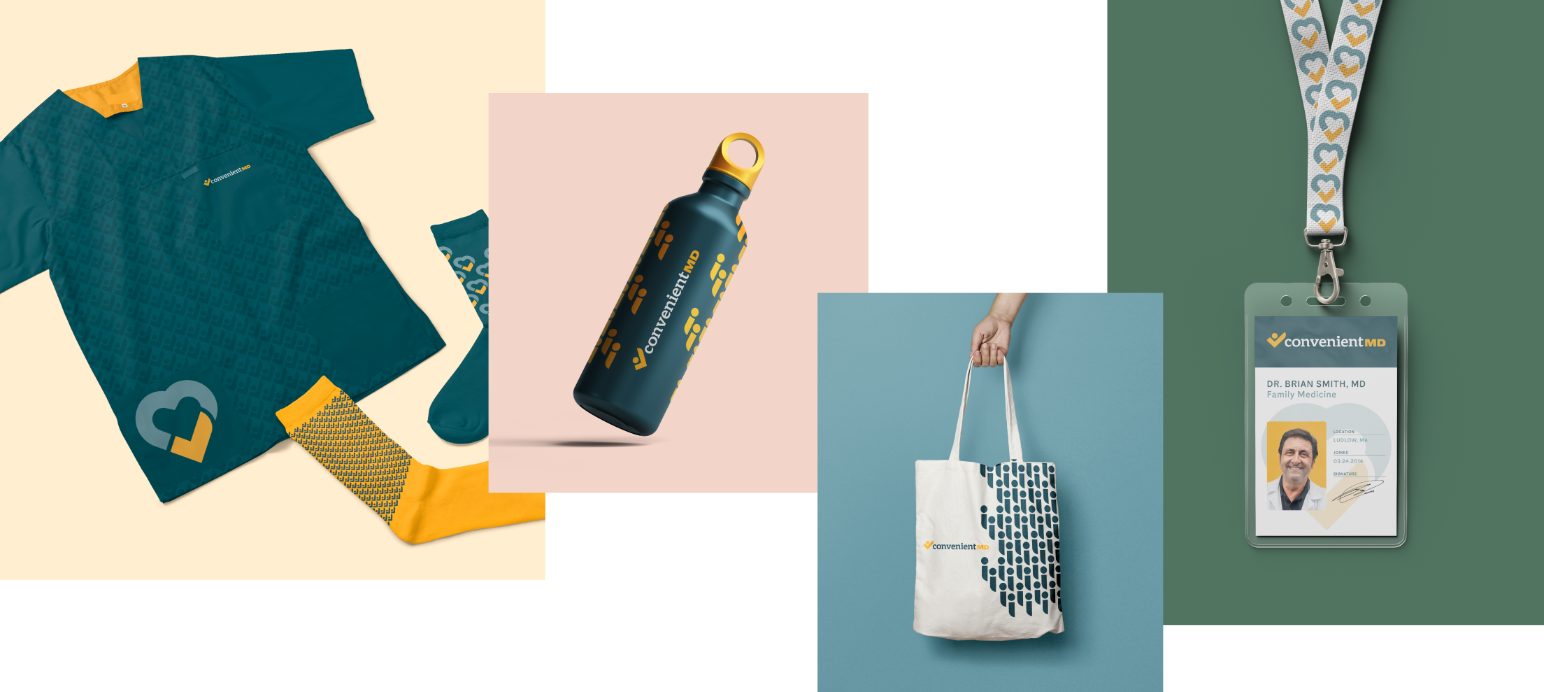
From a new website to new build clinics, the brand came to life in a modern yet warm way. Every brand touchpoint had an element that would surprise and delight to help us build trust with our audience and stand out from the cold, clinical competitive set.
Rather than functional calls to action, our seasonal video ads lean into humor and humanity we all secretly share in the season’s worst symptoms.
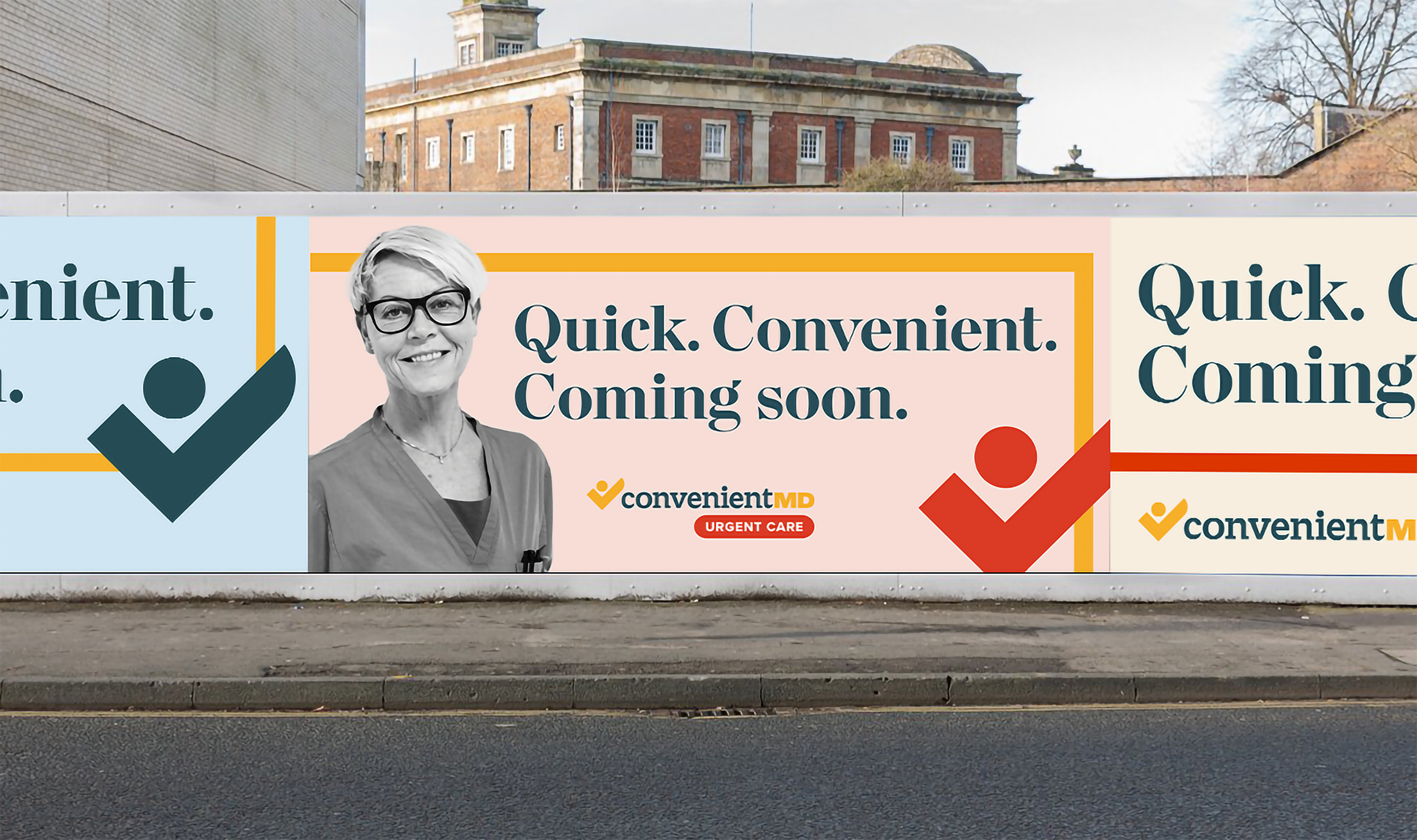
As new clinics open, we’ve established a funnel of communication to build awareness and consideration in each new market, such as these geo-targeted social videos that ran as new clinics opened.
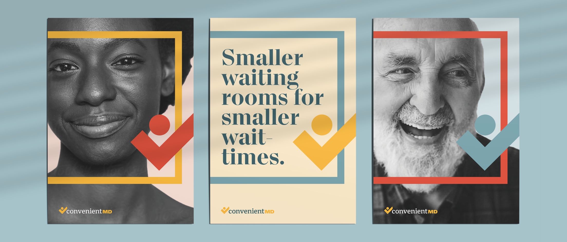
Posters were also printed for customers to see in-clinic, to publicly underscore their values as a very real way to stand out against their competitive set.
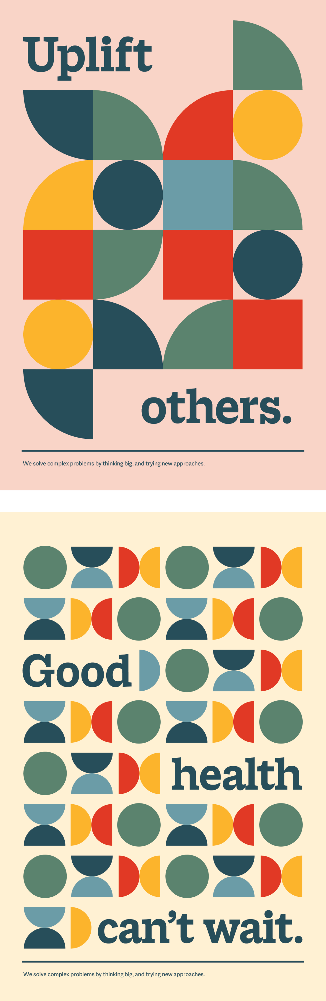

ConvenientMD is led by its company values and wanted celebrate them in a poster series. We flexed the brand’s new visual identity and iconography to craft several series of posters which could live throughout their HQ.
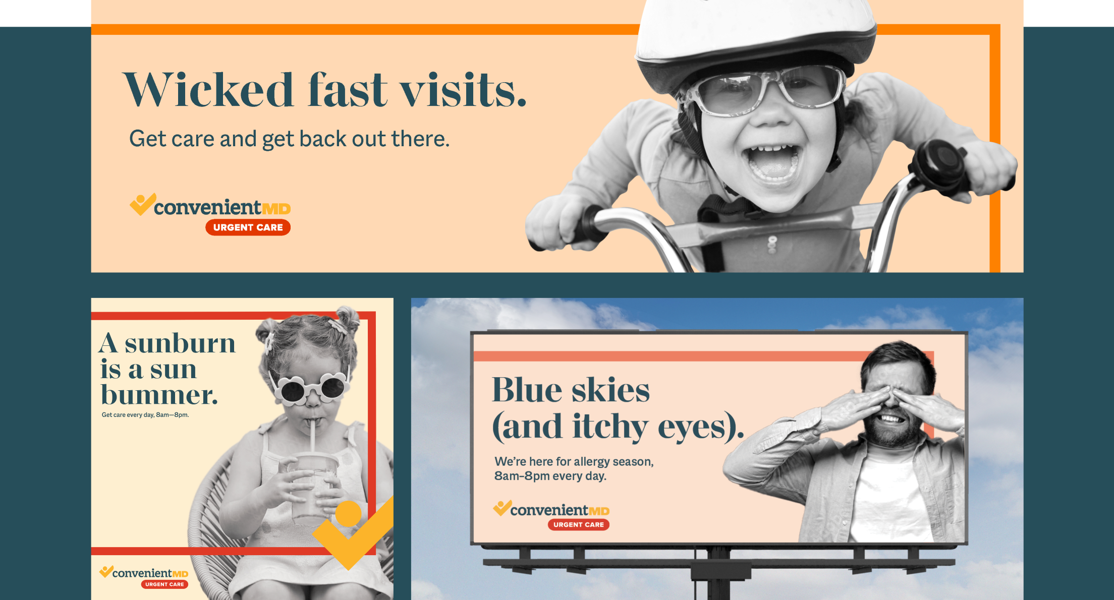
Each season, OOH and digital work combine simple, fun headlines with playful photography that activate our brand elements in a distinctive and memorable way.
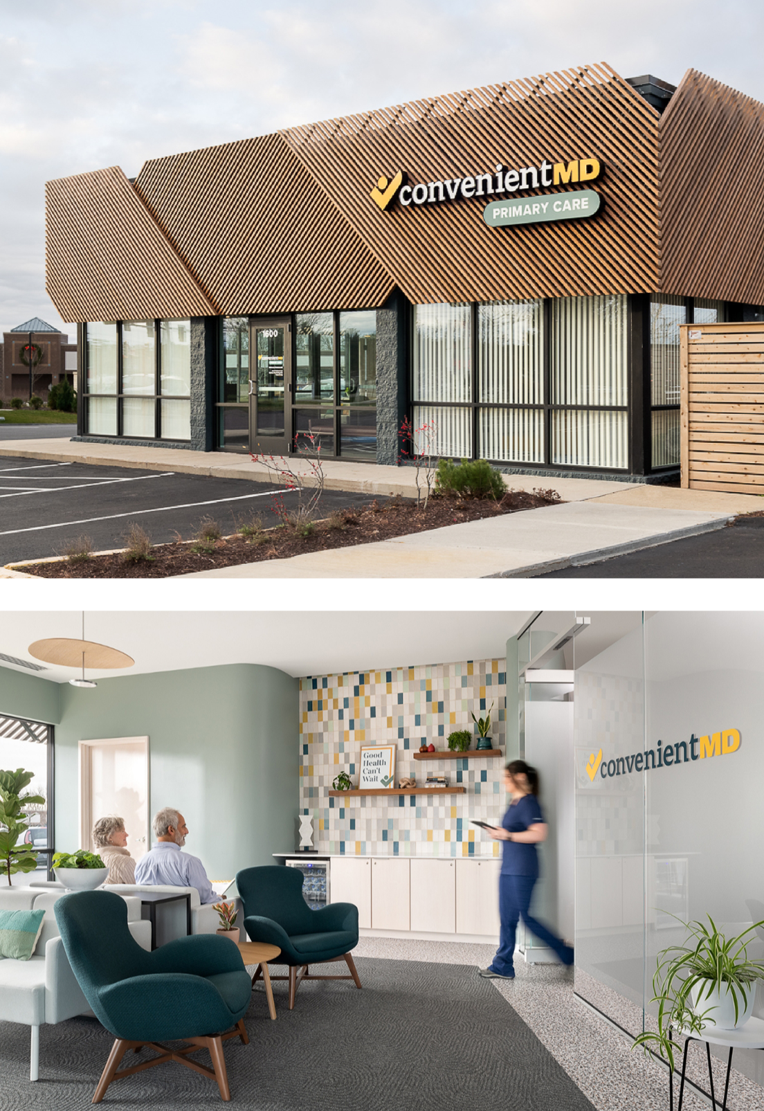
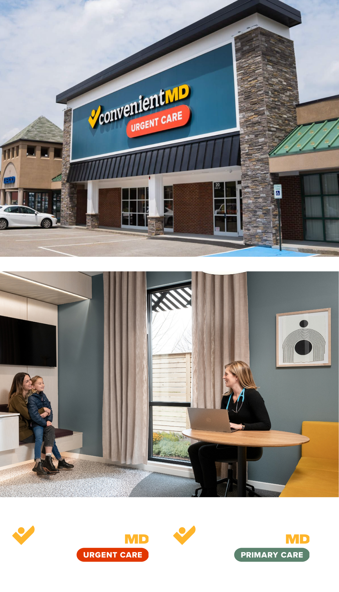
Our identity for ConvenientMD needed to be reactive in physical spaces and landscapes—highly legible by car, welcoming up close, and flexible enough to work with new builds and existing clinics-alike.