Minimalist vs Maximalist: What package design technique should you use?
Minimalism vs Maximalism: Which package design technique should you use?
Have you ever found yourself walking through the ice cream section of the food store, telling yourself you’re not going to buy anything? Then, you take a quick glance at some Hagen Daz Chocolate ice cream sitting in the freezer, the intricate detailing on the cover, chocolate chunks front and center just asking to be picked up. But wait, just next door there’s Talenti Mint Gelato, with the clear container showcasing the soft green mint chocolate chip gelato inside. The only text on the front, Mediterranean Mint, is soon calling your name.
So why is it that we find ourselves drawn to these two distinct but different types of ice cream containers? One sophisticated and bold, the other clean and simple.
This is the power of the minimalist and maximalist packaging styles. Both are eye-catching when done right but use opposing design techniques. The stark difference in their composition is what allows them to shine next to competitors. Due to the strength and modern look of their designs minimalism and maximalism have gained popularity.
In recent years, when there has been an increase in the number of minimalist designs there is a consistent counterbalance of maximalist packaging. When an industry or market gets saturated with one style, brands turn to the opposite to stand out. The juxtaposition of each design techniques’ core principles is what allows brands to differentiate themselves and find a unique niche for their packaging amongst the shelves of other products.
Here at BRIGADE, we specialize in packaging design for brands big and small across a variety of industries. Being a branding and packaging design agency, we have worked with brands to create both minimal and maximal designs for their products. We have found that both of these distinct styles can be highly effective at telling your brand story but which one will work best for your company requires you to consider the story you’re trying to tell with your packaging.
In this article, we will show you the difference between minimalist and maximalist packaging so you can choose the best option for you!
What is minimalist packaging?
Minimalism is a style that is defined by having extreme spareness and simplicity in its design. This is a fairly broad definition of what minimalist design actually looks like in practice. You can see a variety of different styles that can all be placed underneath this category; flat illustration, bold typography, transparency.
Certain industries lean towards minimalist design because it is seen as a very modern look. Brands in skincare and technology utilize the simplicity of the design to create a sense of innovation through clean lines.
One brand that has defined themself using minimalist packaging is Apple. Any time you buy one of their products, you know you’re getting a matte white box that showcases the product with simplistic Apple branding. The reason why this style of branding is so iconic is because they have cultivated a connection between their products and a feeling of innovation. Their brand has become so ingrained in our society that their packaging style has become synonymous with high quality due to the experience consumers get by opening them.
Here’s how you can utilize minimalist packaging effectively for your brand:
How to use minimalist packaging effectively
The thing that minimalist design does best is focus the consumer’s attention on specific information provided on the packaging. With fewer graphic elements, brands focus on what the key selling points of the product are so consumers get a clear understanding of what the product is and why they should choose it over the competition.
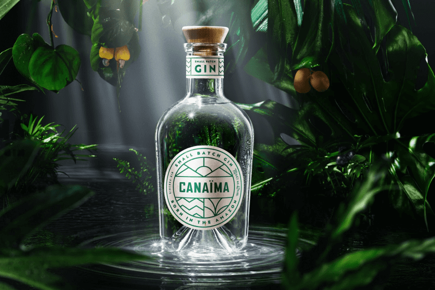
Canaïma Gin is a great example of how a liquor product can take minimalist packaging to the next level. This unique product is inspired by Amazonia and focuses on sustainability and helping to protect and preserve indigenous tribes. With such a strong connection to the Amazon and the diverse plants and people, Canaïma needed packaging that could tell the story of their company’s values.
Canaïma Gin utilizes minimalist packaging to its fullest to achieve this connection through a simple front label with clean geometric lines that tell the story of the Pemones indigenous culture. The rich green color that’s combined with the white labels creates the association that this product is vibrant and natural. Strong sans serif typography gives the packaging a more modern and refreshing feel. Although this packaging is not flashy like some other gin brands, the clean design allows it to succinctly tell it’s a brand story and differentiate it from what other gin brands are creating.
The airiness of minimal designs, especially when paired with die cut sections and, in this case, clear glass, can play to the natural aspect of a product. By having the product be essential to the packaging, you let the product speak for itself.
 https://thedieline.com/blog/2020/3/30/dont-sleep-on-blink-coffee
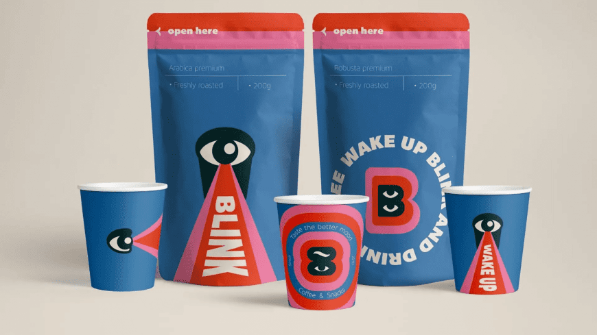
While Canaïma used minimalist packaging in a subtle product forward way, BLINK coffee uses bright colors and strong typography to stand out. This packaging concept by Ana Mininoshvili showcases how simple but bold graphics can be eye-catching and can help appeal to a younger demographic.
BLINK’s in-your-face, highly graphic packaging plays off of consumers’ curiosity. The packaging doesn’t come right out and say what the product is. Instead, it evokes an emotion around the brand and product. A lot of food packaging features the product itself whether that be in the form of a photo or illustration to cue the consumer into what they’re buying. BLINK chooses to forego those traditional graphics to tell a unique story through text and color.
By combining the shape of a coffee cup with an eye, BLINK’s logo brings life to the packaging art in a very graphic way. Without too many details, they are able to express that their coffee is vibrant and will give you the energy to take on the day. Instead of cluttering the design with excess graphics, BLINK narrows down which visuals represent the brand the most and focuses on those to tell the product story.
What is maximalist packaging?
Maximalism focuses on details, having a bold design with patterns or textures, repetition, and layering. Although minimalism is seen as more trendy in recent years, popular brands have been utilizing the distinct ornate, sometimes handcrafted feel that comes from maximalism’s more intricate designs.
Done well, maximalism can give a brand a sense of luxury, opulence, and strength. Due to the amount of detail that is on the packaging, brands are able to tell a larger story that consumers can connect with. By having more chances to showcase brand values there are more opportunities for a product to connect with consumers and that relationship is what provides power to a company.
An industry that has latched onto and expanded the maximalist design style is the alcohol sector. Certain wine, beer, and craft hard liquors are turning to more complex graphics to accompany their products because of the grandeur and status it provides. The packaging feels like an experience, which in turn makes drinking it an experience as well.
How to use maximalist packaging effectively
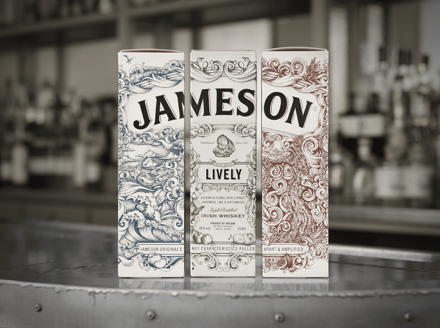
Jameson is one of the most iconic Irish whiskey brands and their Deconstructed Series focuses on the three components that make their product original. The three variations in packaging correlate to the distinct blends that make up the series; pot still whiskey, grain whiskey, and oak contribution.
Jameson contrasts the large bold type of their name that wraps around the package, with the delicate and ornate illustrations that tell the story of the brand and the flavor profile of the product. With this maximalist design, everything is in the details. Each package has a distinctive ship on the front which is a nod to the classic Jameson family crest, which also featured a ship.
The color of each box again emphasizes the flavor of the product. Jameson Round has sepia hues that highlight the woodiness of the oak barrels, bourbon barrels, and sherry butts that can be tasted. Tree trunks and woodland creatures give this product an earthiness that cues consumers into the experience they’ll have. The green Jameson Lively packaging is much more playful with illustrations of music and flowers for a whiskey with floral flavors but hints of Turkish Delight and licorice.
Each aspect of the illustration on the packaging gives the consumer more information about why this whiskey is special.The subtle gold foil accents around the Jameson name as well as the product name gives it added class.
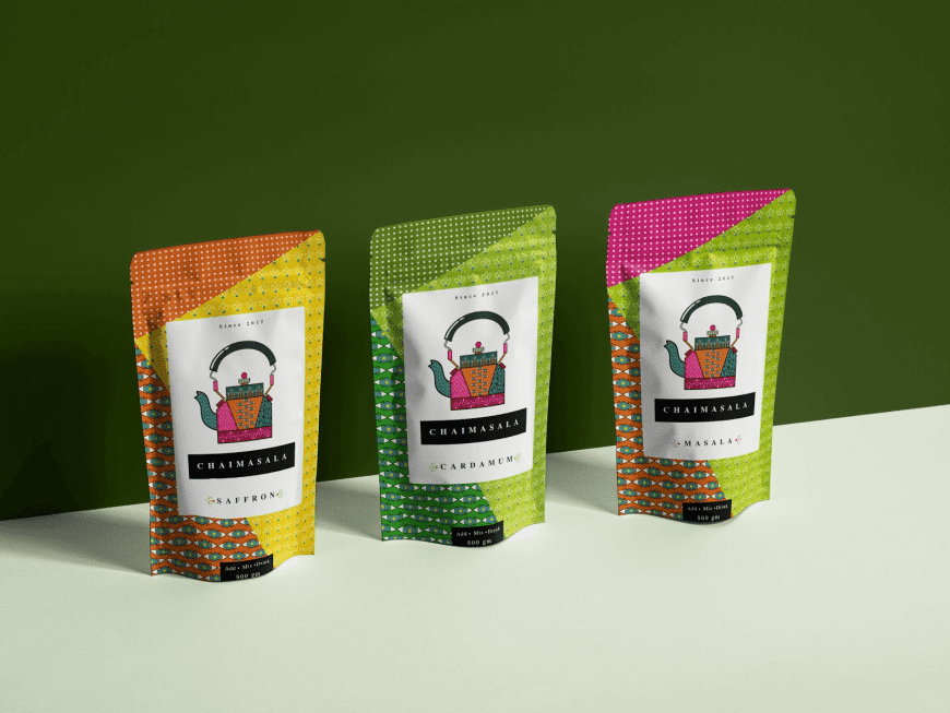
However, not all maximalist packages have to be going for the opulent feel, as seen with this concept for Chaimasala teas. They employ patterns and color blocking to keep their packages modern while bringing vibrancy through their designs.
The patterned kettle on the front not only justifies the designs on the background but also reflects the traditional tea kettles from India used to make these teas. Although the background is busy with small details, the white box on the front of the packages focuses consumer’s eyes on key information about the product. The colors used in the patterns on each package emphasizes the flavors of the different products. Warm golden tones for saffron, earthy greens for cardamom, and a blend of bold colors for masala which combines multiple spices into a vibrant blend.
The patterns give personality and add interest while having more muted panels for important text helps to balance where consumer attention is focused. By utilizing maximalist design, Chaimasala teas are able to develop a story around the culture of their product that also ties in the strong flavours of their product.
Which is right for you?
We’ve seen how both minimalism and maximalism can create distinctive packaging that stands out even amongst products that use the same design movement. These two influential packaging styles allow brands to be bold, creative, and expressive when it comes to showcasing the features of their products.
You might still be wondering which style is best for your product and to determine this you’ll have to dive deeper into what makes your product unique and how you can emphasize that. To help you make the right decision, here are some questions you should ask yourself to help guide you to the right answer for your brand.
- What are the key selling points? How can you best represent these?
- What is your brand voice? What is this product or campaign trying to tell the consumer? How does that relate back to who your brand is as a whole?
- What story are you trying to tell? How can the consumer easily understand what your company stands for?
- How can you create a unique customer experience? Is the shape of the packaging different? Could something be interactive in the way they open the package? Or does the experience come from the design itself?
If you need some additional help making your decision, or your mind is made up and you are ready to create an amazing package design for your product, reach out to Brigade and schedule a design consultation.