Is your brand cheugy? Is this article? Only time will tell.

There are only a few certainties in this world: life, death, and brands seeking to create a lasting connection with their consumers — specifically the younger, more tech-savvy crowd. On top of consumer interests constantly shifting, Millennials and Gen Z also prioritize brand loyalty less than the previous generations’ shoppers, making it even harder for brands to effectively and consistently establish and retain this connection. While it can be hard to connect, in 2021, there’s a sure fire way to make consumers run, and that’s being “cheugy.”
Cheugy is a concept that’s come to dominate Gen Z discourse. Introduced on TikTok in March 2021, the term is this generation’s way of telling the older generation that they’re out of touch. In fact, the term made this year’s list of the most mispronounced words (it’s CHOO-gee, by the way). But don’t worry, anyone (and anything) can be cheugy, no matter their age.
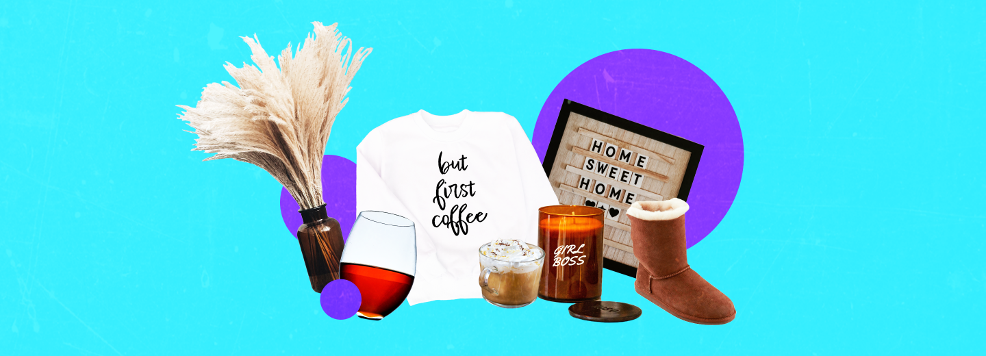
Designs like food jars with a single cursive word describing its contents, wooden signs etched with “Love,” or “Home,” or saying “you’re welcome” in response to “thank you” are (apparently) all considered cheugy. It may seem oddly specific, but Gen Z is very sensitive to overused trends and quick to shame anyone who continues to tire them out further.
One such trend that’s now considered cheugy is minimalism — specifically the minimalist, stripped-back designs companies employ while rebranding.
This genre of designs took the world by storm in the 2010’s, as we saw countless brands redesign their logo, opting for simplified, stripped back versions. Minimal, clean designs once signified a sense of modernity and refinement. Today, with the oversaturation of such logos, consumers now align themselves with brands that stand out, whether it’s through more explicit imagery (Liquid Death’s grotesque skull logo) or a play on their company’s identity (Apple’s the obvious one, but also think Airbnb, or even Cisco, whose logos, although minimal, still communicate their brand’s character).
A brand’s logo is one of the first things a consumer comes into contact with, and as is true for everything , you only get one first impression. Logos communicate a brand’s identity, purpose, value, and character in a single fleeting moment, making it a critical visual. And in 2021, if you opt for a minimal logo that disconnects from your brand’s identity in an attempt to appeal to a younger audience, chances are that these very consumers will see right through it and find it cheugy — devoid of any personality, and therefore inauthentic.
Research shows that consumers are more likely to purchase brands they find authentic and trust, and that there is substantial correlation between logo descriptiveness and profit. Logo descriptiveness showcases a brand’s devotion to being more authentic to its consumers. It does this in two ways. First, a descriptive logo clearly illustrates the type of product the company specializes in, making it easier for customers to process and build associations. Second, it shows that the brand isn’t simply following trends trying to fit in, which is what chuegs do. Being unique and sticking to your brand’s personality — now that’s getting with the times.
In addition to the monetary gain of descriptive logos, is audience perception. Following KIA’s rebranding in 2021, along with Petco’s in 2020, many people (including designers) were outspoken on the internet about their dissatisfaction with the direction companies were taking their logos. Countless other brands have fallen into this trap: Gap, Olive Garden, Animal Planet, the list goes on. Look at any logo refresh and more often than not, the refresh takes it in a more minimalist direction that often feels like a bland downgrade.
However, that’s not to say all minimalism is bad. When done correctly, minimalist and clean approaches to design can elevate a brand’s image and recognition, rather than strip it of its identity. There’s nothing inherently cheugy about minimalism, it’s how some companies are using it that’s cheugy.
And speaking of… is this post cheugy? Are we so late to this game that the term itself has become… well, itself? In 2022, will “you’re welcome” still be outlawed? I guess we’ll have to wait and see. Until next time, happy holidays to all of the cheugs out there. Keep up the good work!


