The danger that lies with minimalism in challenger branding

We cannot overemphasize the importance of consistency in branding, particularly when exercising an omnichannel strategy. However, the challenge of doing so has led brands to oversimplify—moving toward adaptable fonts, basic layouts, and monochromatic, stripped-back palettes that make it easier to look cohesive across channels.
The problem with this minimalistic direction is that brands are starting to look the same. With a challenger brand in particular, looking the same is a death blow to the whole concept of standing out.
The feeling is that having a basic, stripped-back identity is safer for brands—if you don’t put your stake in the ground, you can’t be judged for straying from it. And for market leaders, this can be true and effective. Storytelling can be layered onto simple foundations, and as a market leader, you have the budgets and bandwidth to consider a multipronged PR/influencer/content strategy to help bring the brand to life across channels.
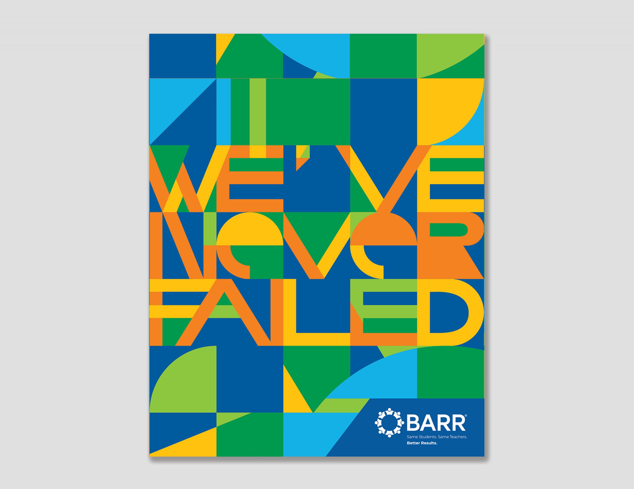
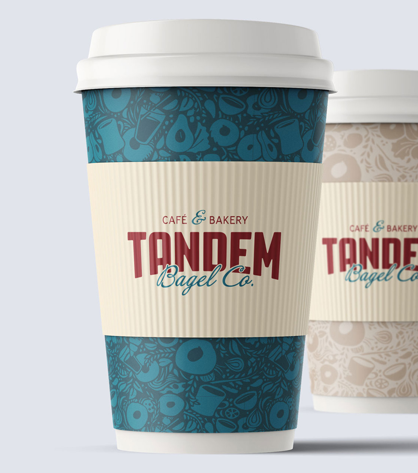
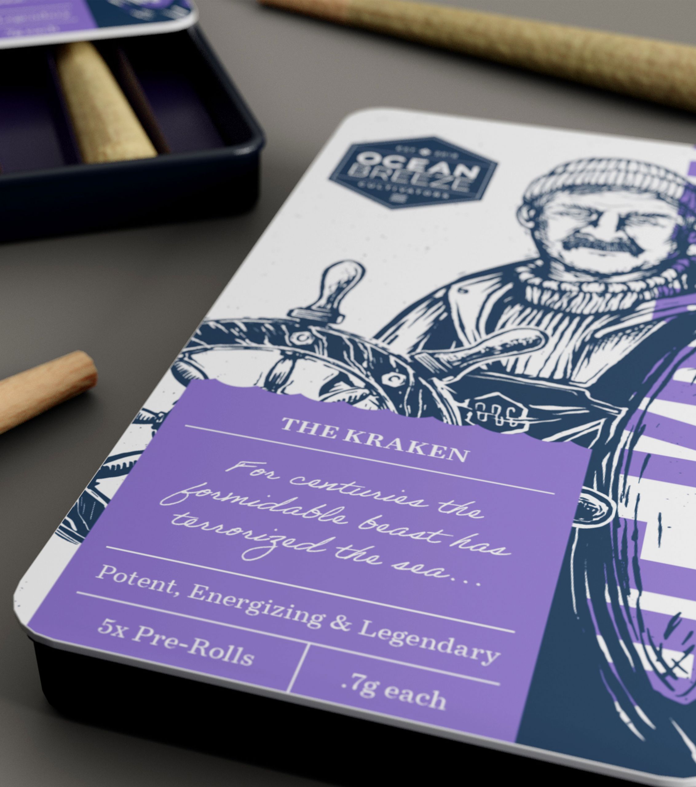
But as a challenger, you need to get it right with less money… which means… go bold. Be the one-of-kind brand you are. Don’t fall into the trap of overly-simplified, generic branding. Take a risk, tap into artistry, create custom fonts, and go with brave colors.
Most importantly, make sure you’re working with a branding firm that can help you with authenticity and consistency. When you refresh your brand, do it strategically, considering your positioning, market goals, and the competitive set. Lay a strong foundation to create something ownable that can garner the love and attention your brand deserves.


