Graphic design in an election year

At BRIGADE, we live and breathe design. In our work day-to-day, we help to create and reinvigorate brands through storytelling and design. At home, in our free time, you can catch most of us thinking about design. Reading about design. And scouring magazines and websites for inspiration (for design).
No one has to convince us that design is important. We believe that it is — whether we’re working on projects that have clear implications for people’s lives, or not.
But in an election year, the importance of design moves to the forefront. Whether you’ve thought about this or not, if you’ve watched television, scrolled through social media, or read the newspaper in the last year, you’ve been participating in the race to be won over by these candidates. Like it or not, you’re being influenced.
According to Lukas Bentel, co-founder of the creative studio Hello Velocity (as reported by Vox), “The importance of visual language has never been stronger.” And yet, he goes on to say, “Despite this fact, political coverage and analysis often overlooks the more subtle nuances of imagery that can silently but strongly influence the way we perceive candidates.”
During an election year, the news cycle is filled with the storytelling of each candidate. What they said. What they’ve promised to do if we put them in office. But discussion about the visual language they’re using is often left out. Sure, there’s conversation in design circles about campaign logos. We talk about what we like and what we hate, and wonder why no one feels safe to step outside of that red and blue container. But in general, no one is asking Joe Biden or Donald Trump about the decisions that went into their campaign logos.
Maybe that conversation isn’t in the cards for most of America. But once you start noticing these things, it’s actually pretty hard to stop.
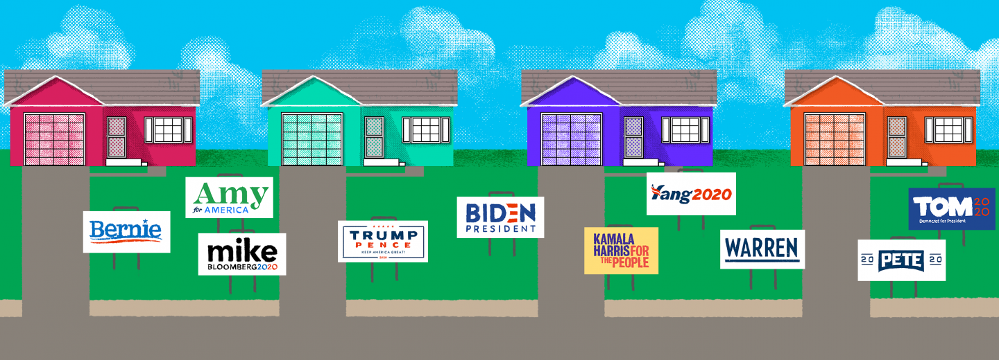
Just look at the array of presidential campaign logos for 2020. There’s a lot of red and blue, which is expected. But look more closely. Biden is using a bold, blocky text. The logo is predominantly blue, with just a little bit of red to pull in the idea of the flag. And notice his use of the word “President”. Even the current president isn’t using that word.
Bernie’s logo is more playful. There are curves and gradients that evoke motion and forward-thinking. Mike Bloomberg used his first name, which (according to the Center for American Politics and Design) is more common for women.
Which ones speak to you? How do you feel when you see WARREN in the black, all caps sans serif? It’s forceful. It’s strong. It’s a very different vibe than “Amy” in the friendly, green serif.
All of these details matter, and none of them came from left field. Like the design we believe in at BRIGADE, every decision is born from a strategic process — considering the audience, the position, the voice and tone, etc.
Fast Company reported on this topic in January of 2019, after digging into the research going on at the Center for American Politics and Design, run by Susan Merriam.
“Look at the hundreds of campaigns run over the past year, and you’ll see candidates using design to market themselves as anti-establishment outsiders or friendly, normal, would-be neighbors. You’ll also see evidence of the influx of corporate money, as well as candidates signaling their traditionalist values or “likability,” a quality so often described as lacking in women candidates.”
Simply put, every politician is a brand. And every brand, to stand out among competitors, has to consider their image, their logo, their website, and the words that they use on the campaign trail.
As they’re considering these things, they’re making decisions based on research they’ve done about you. Your interests and challenges. Your favorite colors and the way a particular type treatment makes you feel. So, how have you been influenced this time around, and which brand will you help reign victorious?


